Release notes
What’s new
Content Development
Anti-aliased clipping for elements using the `clip-path` CSS Property
With this version, Prysm brings support for anti-aliased clip-path elements. By default, all clip paths are now rendered with antialiasing. Before they were rendered with no antialiasing unless the old AA clipping feature was enabled which required additional changes and forced the AA on all clip elements, whereas now the AA is per element. To disable the antialiasing, set the CSS property shape-rendering to optimizeSpeed on the element using the clip-path.
For more details about the new property, see the AA Clipping documentation
Core
Add childNodes entries for br elements
Fix the number of childNodes entries
Frameworks such as Svelte and SolidJS rely on the exact size of the childNodes collection to function properly. To maintain consistency, Text nodes are now created for <br> elements within their parent’s childNodes list.
Text nodes for <br> elements are appended after each consolidated text.SVG Improvements
Closer alignment with the SVG 2.0 specification
To provide a more native and predictable experience, Prysm now includes a major overhaul of the SVG implementation, bringing it significantly closer to the SVG 2.0 specification. This defines how SVG features behave internally and how they interact with the CSS cascade. The sections below highlight the key changes.
Improved support for <use> elements
The href attribute is now fully supported, alongside the legacy xlink:href attribute.
xlink:href remains supported for backwards compatibility.A <use> element may reference any SVG element. The referenced element, together with its entire subtree, is cloned into a closed shadow root hosted by the <use> element.
Terminology used throughout this document:
- Source element – the original element being referenced
- Live instances – the cloned copies created inside
<use>
Live instances participate fully in style computation. They inherit styles through the <use> element according to the SVG specification.
They are also truly live:
Changes to the source element propagate to all live instances.
For example, adding a class to the source element updates every live instance, and any resulting style changes are applied automatically.
Inline <use> elements can reference any element within the same shadow tree (or the document if shadow DOM is not used), including content not rendered at its original location (such as elements within <defs>).
<use> elements are supported in external SVGs as well.The x and y attributes are fully implemented and translate the referenced content as defined in the spec.
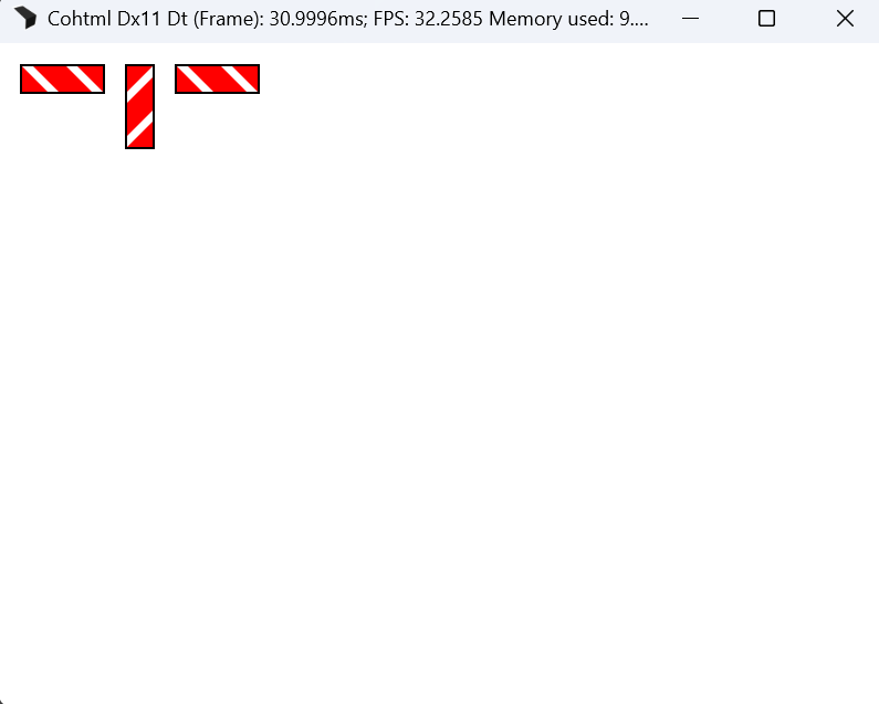
<use> elements cannot currently reference external files (e.g. ./file.svg#aGroup).Example
<!DOCTYPE html>
<html lang="en">
<head>
    <style>
        body {
            background-color: white;
            margin: 0;
        }
    </style>
</head>
<body>
    <svg width="0" height="0" xmlns="http://www.w3.org/2000/svg">
        <defs>
            <g id="aBeacon">
                <path d="M 0,0 L 0,25 L 25, 25 z" fill="red" />
                <rect x="10" y="0" width="30" height="25" fill="red" transform="skewX(45)" />
                <path d="M 75,0 L 50,0 L 75, 25 z" fill="red" />
                <rect x="0" y="0" width="75" height="25" stroke="black" stroke-width="2" fill="none" />
            </g>
        </defs>
    </svg>
    <svg width="300" height="100" xmlns="http://www.w3.org/2000/svg">
        <use x="20" y="20" href="#aBeacon" />
        <use x="120" y="20" href="#aBeacon" transform="translate(-30, 25) rotate(90, 157.5, 32.5)" />
        <use x="160" y="20" href="#aBeacon" />
    </svg>
</body>
</html>
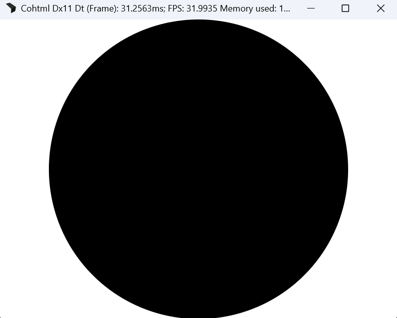
CSS units inside SVGs
CSS units now behave according to the specification when used in SVG attributes.
This means SVG properties accept CSS length-percentages, including viewport units.
<rect width="5vh">
vw, vh, and vmin.Example
<!DOCTYPE html>
<html lang="en">
<head>
    <style>
        body {
            background-color: white;
            margin: 0;
        }
    </style>
</head>
<body>
    <svg width="100vw" height="100vh" xmlns="http://www.w3.org/2000/svg">
        <circle cx="50vw" cy="50vh" r="50vmin" />
    </svg>
</body>
</html>
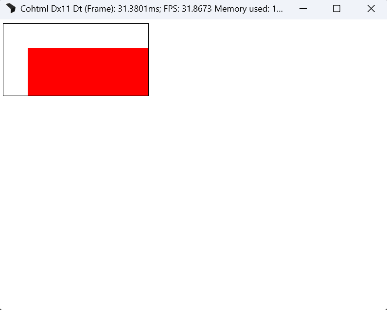
Multiple layout fixes and improved viewport negotiation
A large number of layout-related improvements ensure that SVGs behave consistently and according to expected web-standards rules.
Of particular note:
The viewport negotiation algorithm now respects:
preserveAspectRatio- the intrinsic dimensions of the SVG content
- the surrounding layout system
This applies everywhere SVG content is used: inline, background images, <img> sources, border images, etc.
Example
<!DOCTYPE html>
<html lang="en">
<head>
    <style>
        body {
            background-color: white;
        }
        img {
            border: 1px solid black;
        }
    </style>
</head>
<body>
    <img src="./index.svg">
</body>
</html>
<!-- index.svg -->
<svg width="20%" height="20%" xmlns="http://www.w3.org/2000/svg">
	<rect x="10" y="10" width="50" height="50" fill="red"></rect>
</svg>
Inspectable SVG nodes
SVG nodes now expose their computed bounding boxes in the inspector. Hovering an element highlights its exact geometry.
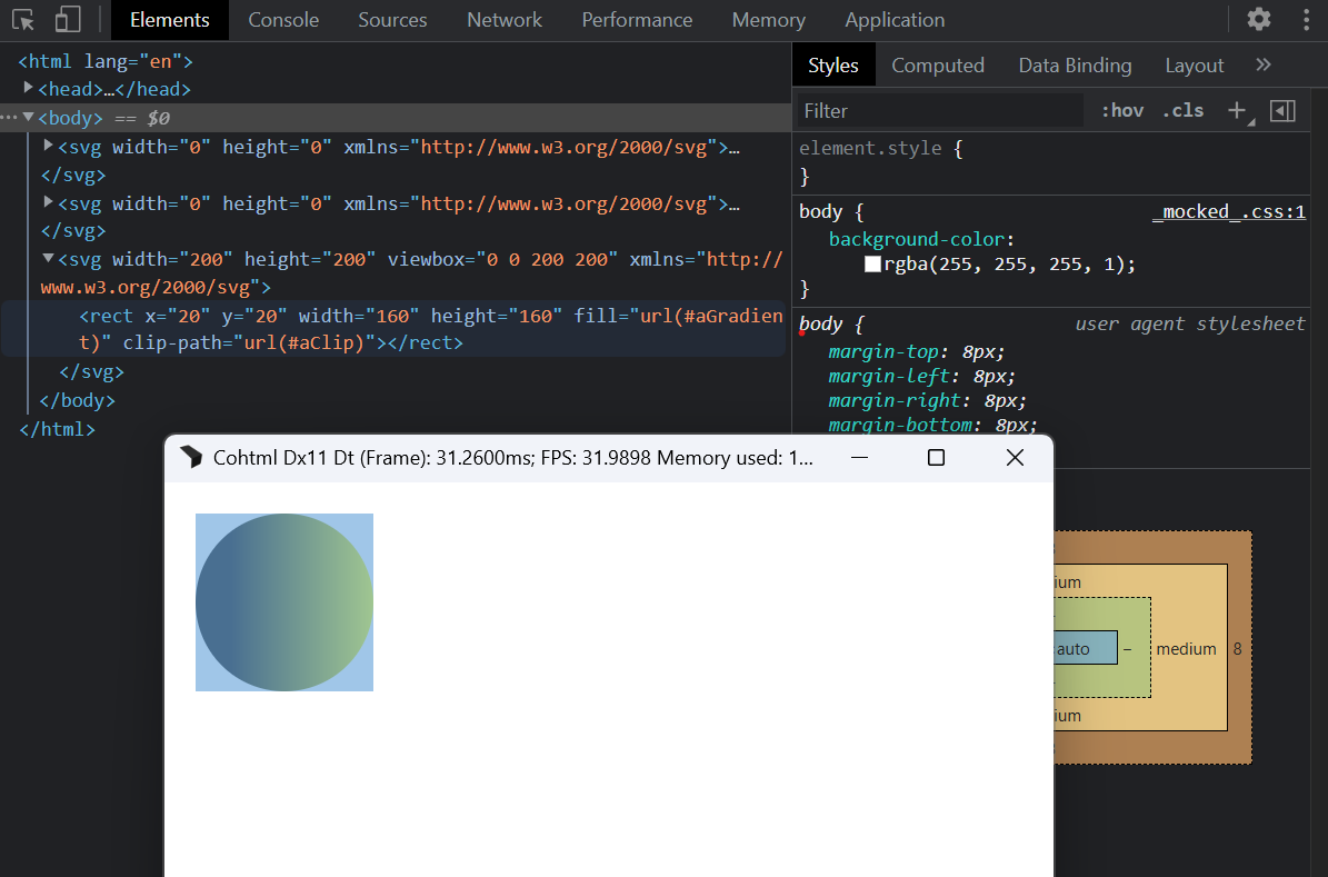
Cross-SVG coverage effects and paint servers
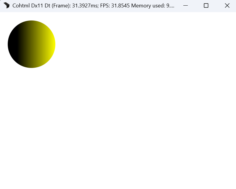
Coverage effects (mask, clipPath) and paint servers (linearGradient, radialGradient, solidColor) may now be referenced across <svg> boundaries.
This enables scenarios where definitions in one SVG affect rendering in another.
<!DOCTYPE html>
<html lang="en">
<head>
    <style>
        body {
            background-color: white;
        }
    </style>
</head>
<body>
    <svg width="0" height="0" xmlns="http://www.w3.org/2000/svg">
        <defs>
            <linearGradient id="aGradient">
                <stop offset="20%" stop-color="black" />
                <stop offset="100%" stop-color="yellow" />
            </linearGradient>
        </defs>
    </svg>
    <svg width="0" height="0" xmlns="http://www.w3.org/2000/svg">
        <defs>
            <clipPath id="aClip" clipPathUnits="objectBoundingBox">
                <circle cx="0.5" cy="0.5" r="0.5" />
            </clipPath>
        </defs>
    </svg>
    <svg width="200" height="200" viewBox="0 0 200 200" xmlns="http://www.w3.org/2000/svg">
        <rect x="20" y="20" width="160" height="160" fill="url(#aGradient)" clip-path="url(#aClip)" />
    </svg>
</body>
</html>
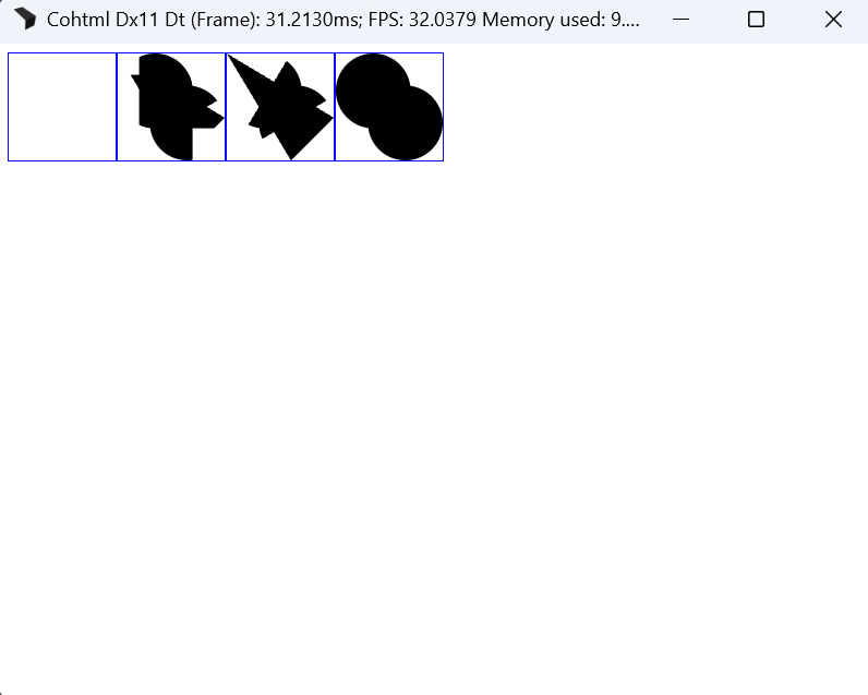
Circular reference chains between coverage effects are resolved to match browser behavior:
We construct a spanning tree and prune cycle-creating references based on DOM order.
<!DOCTYPE html>
<html lang="en">
<head>
    <style>
        * {
            box-sizing: border-box;
        }
        svg {
            border: 1px solid blue;
        }
        body {
            background-color: white;
            display: flex;
        }
    </style>
</head>
<body>
    <svg width="100" height="100" viewBox="0 0 100 100">
        <defs>
            <clipPath id="aClip">
                <rect x="0" y="20" width="100" height="50" clip-path="url(#aClip2)" />
                <rect x="20" y="0" width="50" height="100" clip-path="url(#aClip3)" />
            </clipPath>
            <clipPath id="aClip2">
                <path d="M 0 0 L 100 60 L 60 100 z" clip-path="url(#aClip)" />
                <path d="M 0 100 L 60 0 L 100 40 z" clip-path="url(#aClip3)" />
            </clipPath>
            <clipPath id="aClip3">
                <circle cx="35" cy="35" r="35" clip-path="url(#aClip)" />
                <circle cx="65" cy="65" r="35" clip-path="url(#aClip2)" />
            </clipPath>
        </defs>
    </svg>
    <svg width="100" height="100" viewBox="0 0 100 100">
        <rect x="0" y="0" width="100" height="100" clip-path="url(#aClip)" />
    </svg>
    <svg width="100" height="100" viewBox="0 0 100 100">
        <rect x="0" y="0" width="100" height="100" clip-path="url(#aClip2)" />
    </svg>
    <svg width="100" height="100" viewBox="0 0 100 100">
        <rect x="0" y="0" width="100" height="100" clip-path="url(#aClip3)" />
    </svg>
</body>
</html>
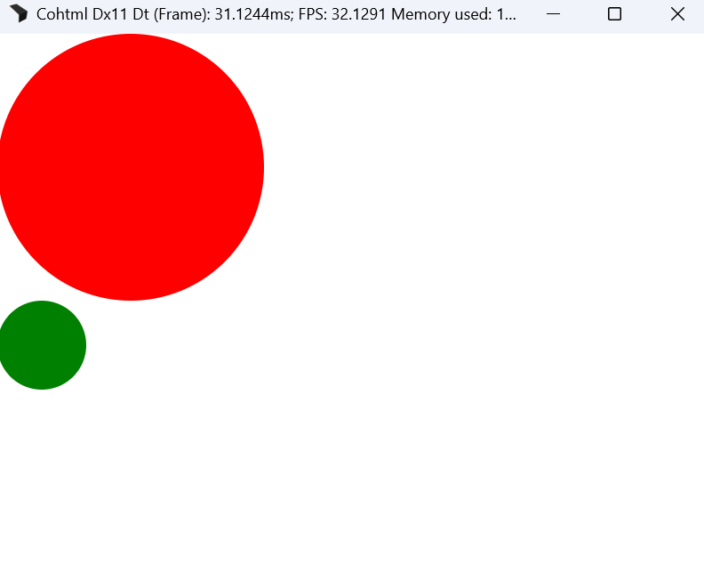
Media queries in external SVGs
Media queries now function correctly in external SVGs, allowing responsive behavior across all SVG content sources.
Example
<!DOCTYPE html>
<html lang="en">
<head>
    <style>
        body {
            background-color: white;
            margin: 0;
        }
    </style>
</head>
<body>
    <div style="background-image: url(./index.svg); width: 300px; height: 300px;"></div>
    <div style="background-image: url(./index.svg); width: 100px; height: 100px;"></div>
</body>
</html>
<!-- index.svg -->
<svg viewBox="0 0 100 100" xmlns="http://www.w3.org/2000/svg">
    <style>
        circle {
            fill: red;
        }
		@media (max-width: 200px) {
            circle {
                fill: green;
            }
        }
    </style>
	<circle cx="50" cy="50" r="50"/>
</svg>
Declarative way to do entry and exit transitions
New features regarding transitions
Modern UI design demands smooth and clean interactions, especially when elements enter or leave the screen. To support this, Prysm introduces Entry/Exit transitions, a new bundle of transition-focused capabilities powered by two additions to the platform: the @starting-style at-rule and transition-behavior for discrete transitions.
Together, these features make it significantly easier to craft polished, predictable transitions for both element entry and exit without the need for any JavaScript, layout hacks, or forced reflows.
@starting-style: Define the First Frame Cleanly
The @starting-style at-rule allows authors to explicitly specify the starting values of properties during an entry transition—even if the properties are not part of the initial computed style.
Why this matters
Before, entry transitions required workarounds such as temporary classes, forced layouts, or keyframe-driven transitions. @starting-style allows authors to declare the element’s initial visual state without hacks.
What it enables
- Natural fade-ins, slide-ins, and scale-ins with no JavaScript
- Reliable initial frames even when DOM or display changes occur asynchronously
- Cleaner, more maintainable CSS transitions
Example: Fade and Slide In Using @starting-style
.card {
	transition: opacity 300ms, transform 300ms;
}
@starting-style {
	.card {
		opacity: 0;
		transform: translateY(20px);
	}
}
This allows the card to transition from invisible and shifted downward to its final state smoothly on entry.
transition-behavior: Discrete Transitions Made Possible
transition-behavior enables transitions for discrete (non-interpolable) properties, such as display, visibility, and others.
Why this matters
Previously, exit animations and smooth state transitions were difficult or impossible without JavaScript delays or animation wrappers. Now, CSS alone can manage these transitions.
What it enables
- True exit animations and transitions powered only by CSS
- Predictable timing of element removal
- More graceful transitions between states
Example: Exit Transition Using transition-behavior
.toast {
	transition: opacity 200ms, display 200ms;
	transition-behavior: allow-discrete;
}
.toast.closing {
	opacity: 0;
	display: none;
}
transition-behavior: allow-discrete ensures display: none waits until the whole transition duration is over before changing the value.
Using Both Together
@starting-style is ideal for defining entry transitions, while transition-behavior makes exit transitions clean and declarative. Together, they support fully fluid component lifecycles.
Example: Fully Animated Entry and Exit
<!DOCTYPE html>
<html lang="en">
<head>
	<meta charset="UTF-8">
	<style>
		.container {
			display: flex;
			justify-content: center;
			align-items: center;
			flex-direction: column;
			width: 100vw;
			height: 100vh;
		}
		button {
			border: none;
			background: none;
		}
		.add {
			font-size: 50px;
			margin: 0 auto;
		}
		.items {
			display: flex;
			flex-direction: column;
		}
		.item {
			display: flex;
			align-items: center;
			justify-content: space-between;
			background: aliceblue;
			border: 1px solid lightblue;
			border-radius: 1rem;
			padding: 0 1rem;
			width: 200px;
			height: 50px;
			transition: opacity 0.5s, transform 0.5s, height 0.5s, display 0.5s allow-discrete;
		}
		.is-deleting {
			opacity: 0;
			height: 0;
			display: none;
			transform: skewX(50deg) translateX(-25vw);
		}
		@starting-style {
			.item {
				opacity: 0;
				height: 0;
			}
		}
	</style>
</head>
<body>
	<div class="container">
		<ul class="items"></ul>
		<button class="add">+</button>
	</div>
	<script>
		function deleteListItem() {
			const listItem = this.parentNode;
			// Unfortunately there is no CSS feature that recognizes when an element
			// would need an exit transition, so we still need to do it with code.
			listItem.classList.add('is-deleting');
			setTimeout(() => {
				listItem.parentNode.removeChild(listItem);
			}, 500);
		}
		function addListItem() {
			const newItem = document.createElement('li');
			newItem.className = 'item';
			const itemText = document.createElement('p');
			itemText.textContent = 'New Item';
			newItem.appendChild(itemText);
			const deleteButton = document.createElement('button');
			deleteButton.className = 'delete';
			deleteButton.textContent = 'X';
			deleteButton.addEventListener('click', deleteListItem);
			newItem.appendChild(deleteButton);
			const list = document.querySelector('.items');
			list.appendChild(newItem);
		}
		const addButton = document.querySelector('.add');
		addButton.addEventListener('click', addListItem);
		for (let i = 0; i < 4; ++i) addListItem();
	</script>
</body>
</html>
This example demonstrates a list of items which have an entry transition when added to the list and an exit transition when removed.
Use Cases at a Glance
- Collapsible menus with smooth open/close behavior
- Toast notifications with clean entry and exit
- Page transitions with clearer spatial flow
- Component libraries needing consistent animation and transition primitives
Summary
Entry and exit transitions are a major step forward for creating expressive, maintainable UI. With @starting-style and transition-behavior, developers can craft fluid experiences without relying on scripting or brittle CSS workarounds.
Inline layout enhancements
Vertical alignment inside inline layout
Prysm now supports the CSS vertical-align property within inline paragraphs (using the cohinline attribute). The supported values are baseline, middle, text-top, and text-bottom.
The behavior of vertical-align in Prysm differs from the standard CSS specification. Reviewing the specific implementation details and differences in the Inline layout section of the documentation is essential for correct usage.
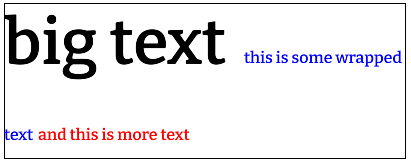
Enhanced inline line box height calculations
Line box height calculations have been updated to adhere more closely to the CSS inline specification. Previously, line boxes in the inline layout were sized solely by the content of the inline boxes rendered on that line.
With this update, inline line box heights respect logical height contributions, including font metrics and line heights inherited from parent elements. Consequently, a line box will now correctly expand to fit its calculated line height even if the elements within it contain no text, or if their text content has a smaller line height than the one dictated by the font metrics of an element higher up in the DOM hierarchy.
Multiline container box heights
Additionally, there are changes to the heights of multiline wrapped container boxes within the inline layout.
Previously:
- Multiline containers were positioned at the top of their text content
- Multiline containers were only as big as their own content
Now:
- Multiline containers are always positioned at the top of their first line box
- Multiline containers are as tall as the sum of heights of all lines they participate in
- This can be observed in the example below - the border of
parentExpandingLineHeight
- This can be observed in the example below - the border of
Example
In the snippet below, the parentExpandingLineHeight element forces the second line to expand based on its 64px font size, making the line box much taller than the visible 16px text inside it.
<div style="width: 400px;">
    <p style="display: inline; color: black;" cohinline>
        <span style="font-size: 64px;">big text </span>
        <span style="font-size: 64px; border: solid 1px black;" id="parentExpandingLineHeight">
            <span style="color: blue; font-size: 16px;">this is some wrapped text </span>
        </span>
        <span style="color: red; font-size: 16px;">and this is more text</span>
    </p>
</div>
Aspect Ratio
We’ve added partial support for the aspect-ratio property. For more details, see the differences to traditional browsers page
Rendering
HDR in the Player application
The Player application now supports displaying HDR UI content on HDR-enabled monitors. The following CLI options control the HDR behaviour:
--hdr scrgb- starts the Player in scRGB mode, where the backbuffer color values will use Rec709 primaries and be in a linear space--hdr hdr10- starts the Player in HDR10 mode where the backbuffer color values will be in Rec2020 colorspace and encoded with the PQ transfer function--display-referred-tonemapping- if given, the UI content will be tonemapped in the reported display capabilities about maximum reproducible luminance. In HDR mode, all of the content in the displayed HTML document is treated as HDR content. For more information, see the documentation page on HDR
Migration guide
Pixel Shader Changes
New shader type
In order to use the GPU path tessellator when clipping with paths, we’ve introduced a new shader type PST_ClipPathAtlas = 36. If you rely on custom shaders and the GPU tessellator is enabled (by default it is), you will need to update your ST_Stencil shader implementation. Below is how this case is handled in CohShadeGeometryStencil.ihlsl:
if (shaderType == 36)
{
	// Clip Path Atlas
	float2 uvPoint = input.Additional.xy;
	alpha = SAMPLE2D(txBuffer, uvPoint) COH_A8_SAMPLE_MASK;
}
Changelog
Version 2.2.0
Released 16 Dec 2025
| API | Updated the CSS color() function to accept alpha values with a slash separator color(space r g b / a). |
| API | Replaced the coh-scrgb custom color space in the CSS color() function with the standard srgb keyword. |
| API | Updated the internal retrieval of a IProperty underlying type from BindValue. This allows user implementations of ToBoolean |
| API | Whitespace nodes are now part of the DOM. This introduces a change in the return value of several JS APIs related to node children. See the documentation about the enhancement for details. |
| API | Corrected scrolling element substitution as per standard. Scroll actions on the BODY are now redirected to the HTML and scroll events for these two elements are fired on the document and the window objects. |
| API | Removed a non-standard behavior of transferring elements to the content part of a template element when using appendChild. Template elements content is populated at DOM build and can now only be changed with innerHTML. |
| API | Removed support for Sony PlayStation 5 SDK 9. |
| Feature | Added support for specifying an aspect ratio on elements via the aspect-ratio CSS property. Image elements are now keeping their source aspect ratio by default. You might need to adapt your UI to the new behavior |
| Feature | Added antialiased clipping on a per element basis. See the documentation on the feature for details. |
| Feature | Introduced new Inspector panels for real-time data-binding insights |
| Feature | Added support for CSS vertical-align baseline |
| Feature | Added support for creating declarative entry and exit transitions using @starting-style and transitioning discrete properties like display. |
| Feature | Added support for Svelte 5 UI framework. |
| Feature | Added Inspector tab for importing and updating data binding models. |
| Feature | Added Inspector tab for the data-binding attributes and expressions affecting specific node. |
| Enhancement | Added support for live instancing of SVG elements via |
| Enhancement | Enhanced SolidJS support on specific use cases which relied on proper whitespace count. |
| Enhancement | Implemented srgb |
| Enhancement | Added proper support for HDR modes (HDR10 and scRGB) in the Player when using DirectX 11 and DirectX 12. |
| Enhancement | Improved performance of the example InternationalizationManager implementation by cloning BreakIterators. |
| Enhancement | Switched to a new flex layout algorithm supporting the gap CSS property. |
| Enhancement | Enhanced support for CSS units in SVG elements |
| Enhancement | Added support for media queries in external SVG resources used as an image |
| Enhancement | Added support for percent values in border-image-slice with SVG borders. |
| Enhancement | Ensured border-image-repeat: space works for SVG borders. |
| Enhancement | Added support for numeric values in border images referencing SVGs. |
| Enhancement | Corrected an issue where border images referencing SVGs appeared blurry when scaled up. |
| Enhancement | Ensured respect for nested <svg> elements' x |
| Enhancement | Ensured viewport units in SVG content work according to specification. |
| Enhancement | Ensured percent units in SVG content work according to specification. |
| Enhancement | Enabled SVG referenceable elements to resolve across separate inline <svg> elements. |
| Enhancement | Displayed SVG nodes highlight in the inspector. |
| Enhancement | Enabled setInnerHTML to parse and add SVG nodes to the DOM. |
| Enhancement | Started sending scroll events when changing the scrollLeft and scrollTop properties. |
| Enhancement | Added support for font-size absolute-size keywords. |
| Enhancement | Improved inline layout algorithm performance by increasing cache usage. |
| Enhancement | Added support for deep clone of template elements. Their content part is now cloned together with the element. |
| Enhancement | Extended IProperty method documentation to clarify expected behavior. |
| Enhancement | Enhanced documentation for mocking game data for the data-binding |
| Enhancement | Added warning messages for data-binding expressions that can not be evaluated. |
| Enhancement | Added support for global backdrop filter in the Player when using DirectX 12. |
| Enhancement | Added support for Surface Partitioning in the samples for Microsoft XBoxOne |
| Enhancement | Updated the Microsoft GDK version to 2025.04. |
| Enhancement | Added support for Sony PlayStation 5 SDK 12. |
| EnhancementUnity | Added a default text transformation implementation in Unity. |
| EnhancementUnreal Engine | Enabled sound in videos on iOS. |
| EnhancementUnreal Engine | Added Live Reload support for relative paths with the project as the root. |
| EnhancementUnreal Engine | Added support for DirectX 12 bindless resources. |
| Fix | Fixed a bug allowing users to set scrollTop/scrollLeft properties to any value for <input>/<textarea> elements |
| Fix | Ensured opacity works with SVG <image> elements. |
| Fix | Fixed an issue where clip-path did not clip elements with opacity 0. |
| Fix | Fixed clip-path clipping with the stroke of its elements. |
| Fix | Fixed viewport-fill to fill the SVG viewport instead of the viewbox. |
| Fix | Fixed an issue where <svg> direct children were not removed and repainted. |
| Fix | Enabled the SVG <use> element to query elements from other inline SVG elements. |
| Fix | Fixed an issue where pseudo element’s content sometimes did not redraw correctly. |
| Fix | Fixed an issue where overflow text sometimes did not redraw correctly. |
| Fix | Fixed an issue where text was unable to scroll in some cases. |
| Fix | Fixed a crash when attaching to content-nothing elements. |
| Fix | Fixed a crash when users assigned the wrong type to a model property. |
| Fix | Fixed a crash on exit when highlighting an element from the inspector. |
| Fix | Fixed inconsistencies when setting styles via data-binding versus JavaScript |
| Fix | Stopped creating break iterators for nodes without text and for nodes whose text cannot break on a new line. |
| Fix | Fixed a crash caused by a missing ITextInputHandler::OnBlur call |
| Fix | Fixed a bug causing issues with stacking contexts and draw order. |
| Fix | Fixed a GC crash when using animations on pseudo elements. |
| Fix | Fixed pseudo elements disappearing from the inspector after the page reloads. |
| Fix | Fixed the number of childNodes entries to include <br> children elements count. |
| Fix | Fixed a crash when calling constructors of undefined custom elements. |
| Fix | Fixed incorrect line heights when wrapping inline text with varying font sizes. |
| Fix | Fixed binding of C++ arrays when not using TryBindArrayByRef with safe by reference binding |
| Fix | Removed ‘missing property warning’ in data binding expressions to match JavaScript behavior to thread undefined properties as false. |
| Fix | Fixed the “Disable JavaScript samples” checkbox under the Inspector’s Performance tab. |
| Fix | Fixed video playback sometimes stalling instead of ending at the end. |
| Fix | Fixed wrongly calling audio callbacks in the ViewListener when playing videos in some cases. |
| Fix | Fixed videos freezing after the first playthrough. |
| Fix | Removed clamping of points on the bezier easing function. |
| Fix | Applied transitions properly when all properties were selected. |
| Fix | Fixed running with MSVC redistributable libraries version 14.28 and newer |
| Fix | Fixed a crash when caretPositionFromPoint failed to hit any node. |
| Fix | Allowed prefetching of the same script or stylesheet when multiple elements in the DOM requested it. |
| Fix | Ensured prefetching of resources/stylesheets works for all elements that reference the same resource. |
| Fix | Fixed visual artifacts when using the compositor in the samples on Microsoft XboxOne. |
| Fix | Fixed multithreaded race conditions causing DOM object lifetime issues. |
| Fix | Fixed infinite recursion with complex selectors in non-inline SVG. |
| Fix | Fixed a crash in the custom effects sample for MacOS |
| Fix | Fixed being able to set style values to NaN from JavaScript and data-binding |
| Fix | Fixed a crash with precise data-binding updates when emptying and filling again a collection. |
| Fix | Fixed unsigned long and long binding precision loss on non- Microsoft Windows platforms. |
| Fix | Fixed NodeFilter callback function appendNode not being called |
| Fix | Fixed elements sometimes matching their removed ID. |
| Fix | Fixed a bug in the GPU resource cache where render targets were not reused properly |
| Fix | Fixed a shader bug that caused invalid values when using the mix-blend-mode CSS property in some circumstances. |
| Fix | Fixed redraw of duplicate layers when using backdrop filter. |
| Fix | Added handling for old integrated Intel GPUs for the DirectX 11 and DirectX 12 native backends. |
| Fix | Fixed a bug causing a crash on Switch when many textures were recreated. |
| Fix | Fixed a bug causing a crash when decoding lossless WebP images |
| Fix | Fixed a crash when using backdrop filter and custom effects |
| Fix | Fixed a bug causing a crash on PS5 when rendering empty views. |
| FixUnity | Fixed data-binding for C# objects on Android for Unity |
| FixUnreal Engine | Fixed memory corruption on Sony PlayStation 5 by reserving the starting virtual address for JavaScript heap near the end of the address space. |
| FixUnreal Engine | Fixed trying to use destroyed textures in Unreal Engine |
| FixUnreal Engine | Fixed the gamma correction when loading raw images |