Rendering Antialiasing
Overview of anti-aliasing
Prysm’s graphics library Renoir does anti-aliasing for jagged lines in a couple of ways. Renoir features automatic anti-aliased geometry generation which can be coupled with a MSAA render target, although it’s recommended to use a single-sample render target to keep the memory consumption low.
Going into more detail, the most traditional one is using a multi-sampled render target. You can do that by simply passing in a MSAA-enabled render target and depth-stencil target with the corresponding sample count to the ViewRenderer::SetRenderTarget API. When doing so, you get anti-aliasing at the cost of the additional memory consumption for the MSAA targets and extra resolving commands. This cost is usually too high and is generally advised to use a single-sample render target and let Renoir handle the anti-aliasing internally.
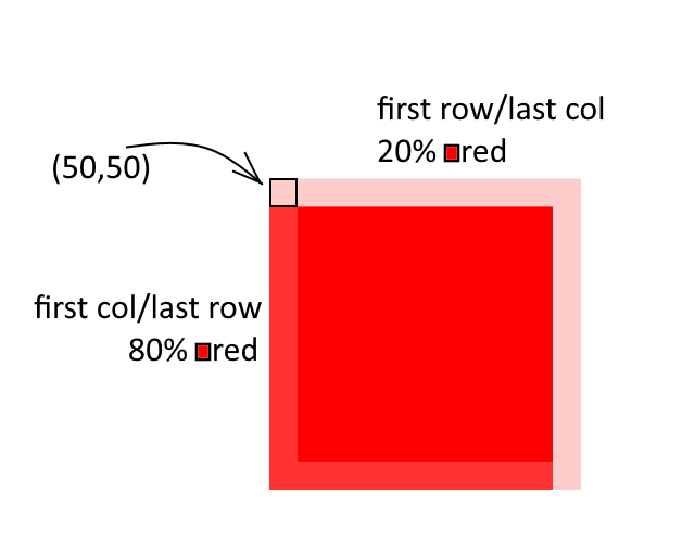
As a better solution, Renoir uses a geometry-based anti-aliasing technique, which doesn’t require any multi-sampled targets from the client. Essentially, line/rectangle-based shapes (e.g. filled rectangles, stroked rectangles, images, line segments, etc.) generate some additional geometry (vertices) for covering a 1-pixel wide border around the drawn shape. These border vertices have their shader attributes set in such way, that any rasterized pixels will receive the value for the actual pixel coverage in the fragment shader. Other shapes such as rounded rectangles, ellipses, circles draw the enclosing rectangle and use a distance field to compute the edge of the shape and anti-alias it. Essentially, Renoir’s shader are set up in such way that lets them compute the pixel coverage and interpret that in some way. Currently, the coverage is simply translated into an alpha value - the more the pixel is covered, the more opaque the final color will be. As a result, anti-aliased edges will be blended with the background. Here’s an example of a red rectangle, positioned at (50.2, 50.8) with 10x10 size.
Major changes between Prysm 1.5 and previous versions
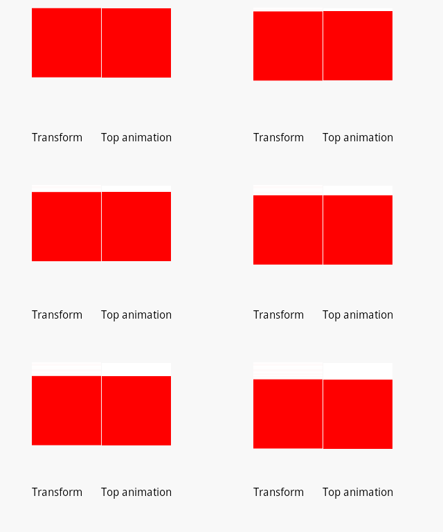
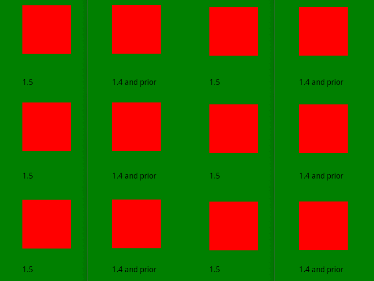
The algorithm used in versions 1.4 and prior tries to generate the minimum amount of geometry, while still anti-aliasing shapes. While this sounds like the perfect combination, it only works well when the shape geometry ends up on integer coordinates. Whenever a shape has fractional coordinates, or the transformation matrix outputs fractional coordinates, they will be snapped to the nearest integer. In static images, this still looks very well, but animations suffer the most, as shapes will jump at least 1 pixel and it can be very noticeable.
Prysm 1.5 addresses that issue and generates 1-pixel wide borders that the shaders use for anti-aliasing. This eliminates the jagged animation at the cost of additional geometry. This cost is very low compared and is a worthy trade-off for the visual clarity gained.
Developer option for disabling anti-aliased geometry generation
Prysm 1.5 allows for initializing the SDK with “developer” options. These are options that are usually used for internal testing. There is no guarantee an option will be present in future versions, have the same functionality across versions, and it’s strongly recommended that users always set them to nullptr. One developer option that clients can use for testing and benchmarks is the --noAAFractionalCoords one. This will emulate the 1.4 behavior and generate anti-aliased geometry for transformed shapes only, lowering the vertex/index buffer load. Note that the visual result may not be exactly the same as version 1.4, because of other changes in 1.5. Once again, it is strongly recommended that you only use this option for testing and make sure you don’t have it enabled for shipping/public builds.
Possible issues and solutions
Animating the top/left properties still results in jagged animation
All elements in Cohtml are snapped to the nearest integer coordinate before they are passed to the graphics library for drawing. This is done for multiple reasons, most notably having a stable image for static elements. Animated elements might need to be handled a bit differently, as outlined in this and the following sections. This snap-to-integer-coordinate means that the client has control over subpixel accuracy only through the transform property. Animated left or top properties will always end up on integer coordinates, even if the original input was a fractional number. That’s why such animation will still appear jagged. If you want to create a smooth animation, you need to use the transform property.
Background color bleeding
When animating 2 or more elements that are right next to each other, background color bleeding may occur. This is because pixel coverage is treated as opacity. The last pixel of the first shape will be drawn as semi-transparent and will be blended with the background. The first pixel of the second shape will also be drawn as semi-transparent and blended with the previously blended color, resulting in color that has some traces of the background, even though the coverage of the two shapes totals 100%. Here’s the effect in motion:
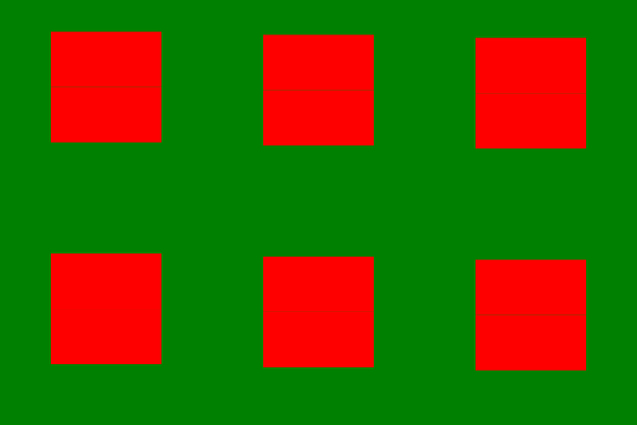
You can check the sample HTML code at the end for a reference how this undesired effect can be easily achieved.
This can be worked around in several ways:
- If the animation is fast enough, you can still use
left/topanimation instead oftransform. The animation will skip whole pixels, but it may be unnoticeable for the user. - You may force the container of the neighboring elements to create its own stacking context, which will implicitly force it to be drawn into a separate texture. Since we’re snapping the coordinates of the content inside the container, they will be drawn on integer coordinates. The end result is a smooth animation of the container and no background color bleeding. The container object may already be creating its stacking context if it has
opacity,filter, ormix-blend-modeproperties. In case it doesn’t, you can always force it with theisolation: isolate;property which has no other visual effect and forces a new stacking context. The downside of this approach is that an auxiliary texture needs to be created, but it’s all under the client’s control.
Reference code for comparison images
<html>
<head>
<style>
body {
    background-color: white;
    margin: 0px;
}

.cont {
    position: absolute;
    left: 0px;
    top: 0px;
}

.inner {
    background-color: red;
    width: 100px;
    height: 50px;
}

@keyframes SlowFallTransform {
    from {
        transform: translateY(10px);
    }
    to {
        transform: translateY(100px);
    }
}

@keyframes SlowFallTop {
    from {
        top: 10px;
    }
    to {
        top: 100px;
    }
}

#c1 {
    left: 50px;
    isolation: isolate; /* comment this to display background color bleeding */
    animation: SlowFallTransform 60s linear infinite;
}

#c2 {
    left: 151px;
    animation: SlowFallTop 60s linear infinite;
}
</style>
</head>

<body>
    <div class="cont" id="c1">
        <div class="inner"></div>
        <div class="inner"></div>
    </div>
    <div class="cont" id="c2">
        <div class="inner"></div>
        <div class="inner"></div>
    </div>

    <div style="position: absolute; left: 50px; top: 200px">Transform</div>
    <div style="position: absolute; left: 150px; top: 200px">Top animation</div>
</body>

</html>