

Scalable UISample
What is Scalable UI
Section titled “What is Scalable UI”A scalable UI is a UI that can dynamically scale up or down to fit bigger or smaller screens. Refer to the Scalable UI documentation for more detailed information on scalable user interfaces in Prysm.
End Result
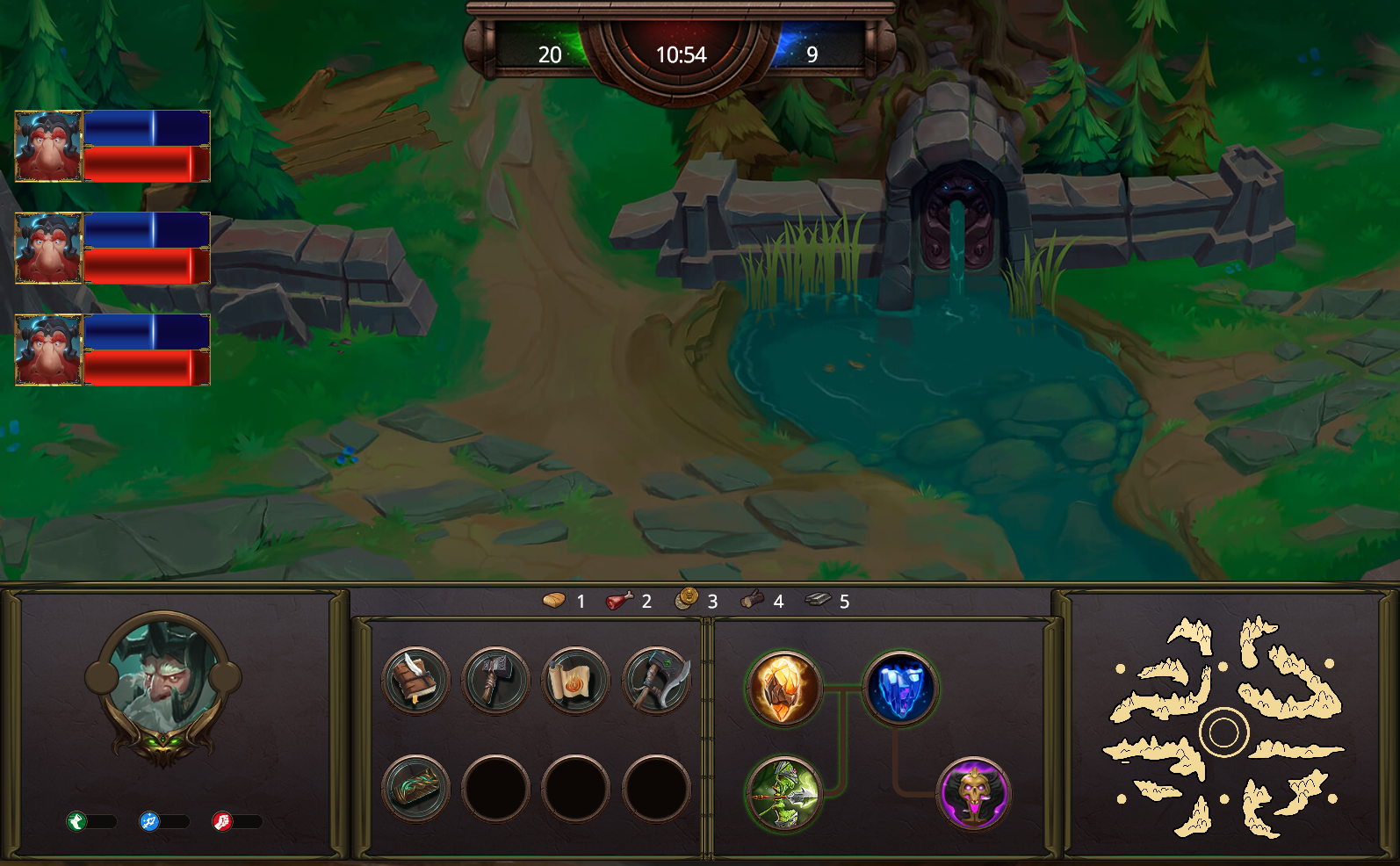
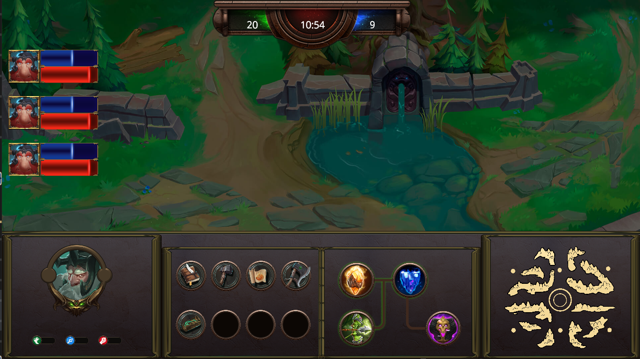
Section titled “End Result”In this guide we’ll create a scalable UI that will look like this:
The following UI will change its size to fit the screen size. We won’t force a fixed aspect ratio but we’ll try to keep the proportion of the UI elements so that they don’t get distorted. To enable such behavior we need to use dynamic units. We can’t use pixels as they will make the size and positions static and they won’t change with the size of the screen. Rem is a dynamic size unit. It uses the root element’s font size. If we set the sizes and positions of all elements using rem units we can update only the font size and the whole UI will automatically scale.
Scaling Using the Font Size
Section titled “Scaling Using the Font Size”As we already mentioned if we use rem units we need to update the root element’s font size in order to scale the user interface. The root element in an HTML document is the <html> element. The number that we’ll use to change its font size is called a scale factor. The current font size multiplied by the scale factor gives us the scaled font size. We’ll use a relative scale factor. We’ll scale the elements relative to their original size. If we needed to double the size of all elements we could use an absolute scale factor of 2 and it would be enough. But in this case, we want the element to change its size in relation to the current screen size. To do so we take the width of the original resolution for which the UI was created and the current screen size. The relation between them gives us the scale factor. For more detailed information refer to the Scalable UIdocumentation.
const rootElement = document.getElementsByTagName('html')[0];// for a full HD resolution - 1920/1080const initialWidth = 1920;
// call on each resizeconst windowWidth = window.innerWidth;const scaleFactorX = windowWidth / initialWidth;const fontSize = 10 * scaleFactorX;
rootElement.style.fontSize = `${fontSize}px`;
Creating the UI
Section titled “Creating the UI”Before we start adding any components we need to set the document’s styles. These are the font size of the root element that we’ll use for scaling and the background of the body. We’ll keep the styles for each component in a separate file. This will make the code more manageable and it will be easier to find the styles for a certain element. The document’s styles as well as common styles used across all elements we’ll keep in styles.css file.
styles.css:
html {    font-size: 10px;}
body {    height: 100vh;    margin: 0px;    background-image: url('images/Terrain_Optimized.jpg');    background-size: cover;    background-repeat: no-repeat;}
All images that we’ll use should have the same background size, position and repeat properties. We’ll define an image class that we’ll apply to all images.
styles.css
.image { background-size: contain; background-position: 0px 0px; background-repeat: no-repeat no-repeat;}Now we can create an index.html file and add basic HTML and the styles.css file that we just created.
<!DOCTYPE html><html lang="en"><head>    <meta charset="UTF-8">    <meta name="viewport" content="width=device-width, initial-scale=1.0">    <title>Document</title>    <link rel="stylesheet" href="style.css"></head><body>
</body></html>
Adding the Status Bar
Section titled “Adding the Status Bar”The status bar is the element centered at the top of the screen. It shows the score of the player’s team, the remaining game time and the enemy’s team score.
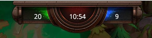
We need an HTML element for each all of the three status updates and one for the background image:
<div class="status-bar image"> <div class="player-team">20</div> <div class="time">10:54</div> <div class="enemy-team">9</div></div>Let’s create a statusbar.css file. Everything is going to be in a single row so we’ll use a flexbox to position everything on the same line.
.status-bar {    overflow: visible;    background-image: url('images/moba/gameStats_Frame.png');    position: relative;    top: 0vw;    left: 33vw;    width: 60rem;    height: 15rem;    display: flex;    font-size: 3rem;    flex-direction: row;    text-align: center;    color: #ffffff;}
.player-team,.enemy-team {    position: relative;    top: 4.2rem;    width: 40%;}
.time {    position: relative;    top: 4.2rem;    width: 20%;}
We set the width of each of the flex elements using percentage values in order to create a scalable grid.
Adding the Nameplates
Section titled “Adding the Nameplates”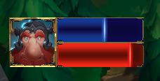
The nameplates should be anchored to the left side of the screen. The nameplate consists of a frame for the avatar, an avatar picture, a wrapper for the resource bars and an image for the mana and health. We’ll need HTML elements for all of these components:
<div class="nameplate image"> <div class="avatar-wrapper"> <div class="avatar image"></div> <div class="avatar-frame image"></div> </div> <div class="bars"> <div class="mana image"> <div class="mana-value-indicator image"></div> </div> <div class="health image"> <div class="health-value-indicator image"></div> </div> </div> </div>Let’s create a nameplate.css file. Flexbox is the easiest way to create a scalable grid in CSS. We’ll use it to style the nameplate:
.nameplate { position: relative; left: 1vw; width: 27rem; height: 10rem; margin-bottom: 4rem; display: flex; flex-direction: row;}The ratio between the avatar and the bars is 35% to 65%. We’ll specify this using styles:
.bars {    width: 65%;}
.avatar-wrapper {    width: 35%;}
Set the sizes of the mana and health bars:
.mana,.health { height: 5rem; background-size: 17.6rem 5rem; position: relative;}Set the background image for the resources:
.mana {    background-image: url('images/panel_mana.png');}
.health {    background-image: url('images/panel_health.png');}
Set the size and position of the avatar frame:
.avatar-frame { position: absolute; height: 10rem; width: 9.4rem; background-image: url('images/itemHover.png');}Set the size, position and background image of the avatar:
.avatar { position: relative; top: 3px; width: 9.4rem; height: 9.4rem; background-image: url('images/moba/heroWidget_Portrait1.png');}This will give us one nameplate. Add as many as you’d like on your page.
Adding the Main Frame
Section titled “Adding the Main Frame”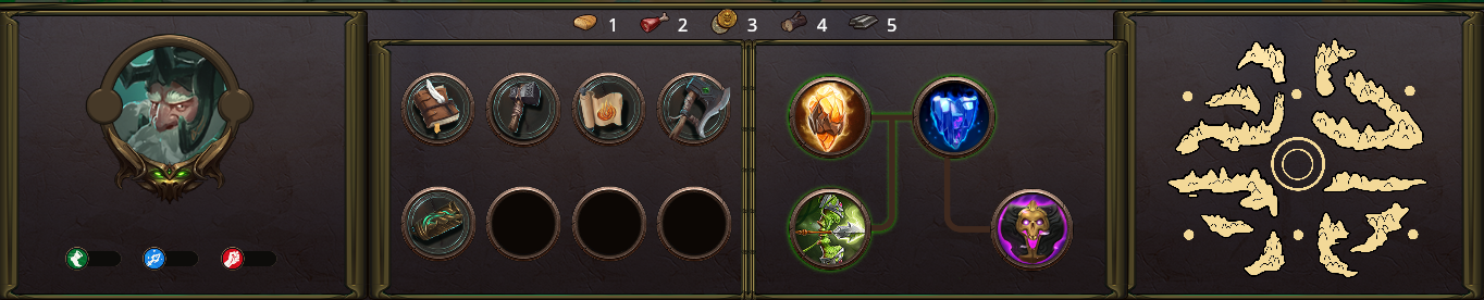
The main frame is divided into 3 main parts - left, middle and right. The middle part is also divided into two parts. This is the base HTML structure of the grid:
<div class="main-frame"> <div class="left"> </div> <div class="middle"> <div class="top"> </div> <div class="bottom"> </div> </div> <div class="right"> </div></div>Again, we’ll use a flexbox for the grid. Put these styles in a main-frame.css file:
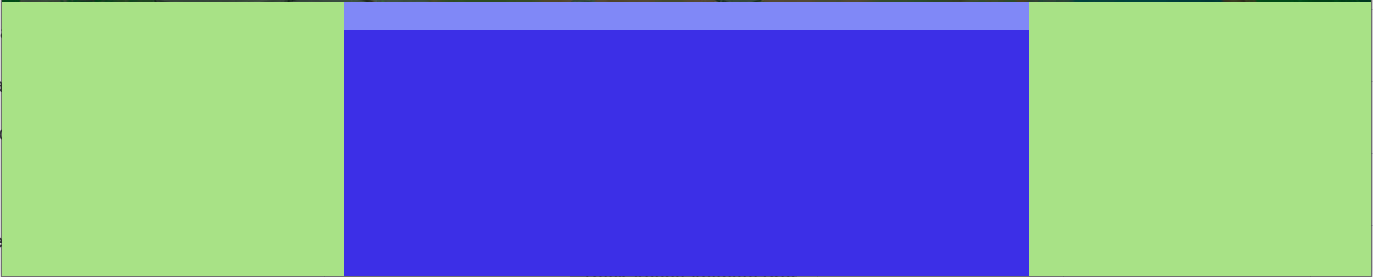
.main-frame {    width: 100vw;    height: 20vw;    position: absolute;    bottom: 0px;    display: flex;    flex-direction: row;}
.left,.right {    background-color: #a8e286;    width: 25%;}
.middle {    background-color: #4670e2;    height: 100%;    width: 50%;    display: flex;    flex-direction: column;}
.top {    background-color: rgb(128, 136, 247);    display: flex;    flex-direction: row;    justify-content: center;    height: 10%;}
.bottom {    background-color: rgb(60, 47, 231);    height: 90%;    display: flex;    flex-direction: row;}
Set some background colors so that it’s easier to see the result, which should look like this:
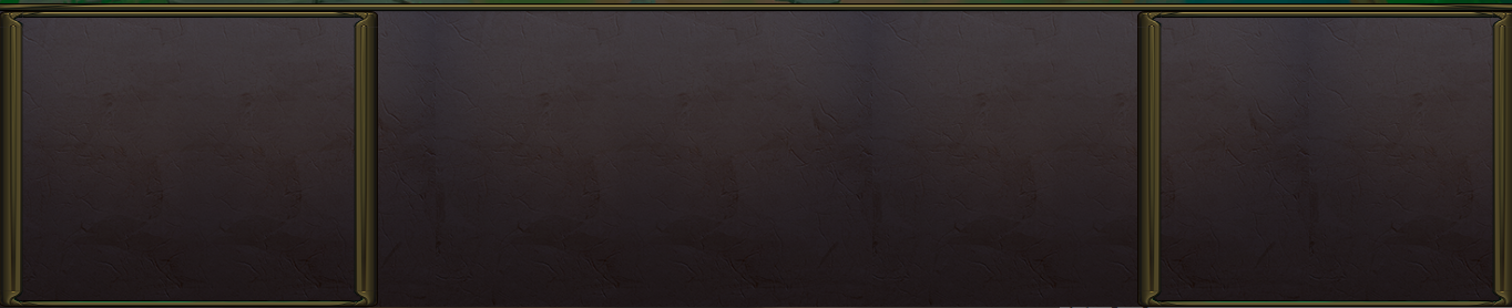
Let’s add border style to the main frame and remove the background color:
.main-frame {    width: 100vw;    height: 20vw;    background-image: url('images/moba/background_dark.png');    background-size: contain;    background-color: #ebebeb;    background-repeat: repeat;    position: absolute;    bottom: 0px;    display: flex;    flex-direction: row;    border-top: 1rem solid;    border-image: url('images/moba/border_top.png') 30 stretch;}
.left,.right {    width: 25%;    border-top: 2rem solid;    border-bottom: 2rem solid;    border-left: 3rem solid;    border-right: 3rem solid;    border-image: url('images/moba/border.png') 30 stretch;}
This is what the frame should look like:
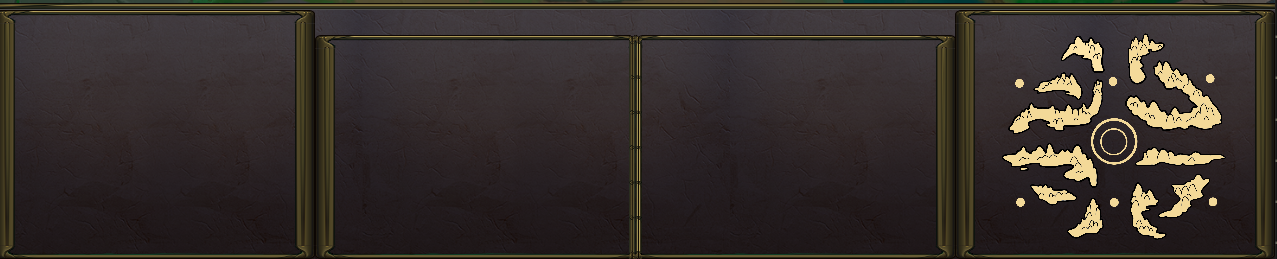
Let’s add the sections in the middle part. There should be two panels - one for the inventory and one for the talents tree:
<div class="main-frame"> <div class="left"> </div> <div class="middle"> <div class="top"> <div class="resources"> </div> </div> <div class="bottom"> <div class="inventory"> </div> <div class="vertical-separator"></div> <div class="talents"> </div> </div> </div> <div class="right"> </div></div>We’ll have a centered horizontal list of resources at the top of the middle section. We add dummy filler panels just to help center the middle resources element. In the bottom part, we have the inventory, the talents and a separator between them.
.vertical-separator {    border: 1rem solid;    border-image: url('images/moba/separator.png') 30 round;}
.inventory,.talents {    width: 49%;    border-top: 2rem solid;    border-bottom: 2rem solid;    border-left: 3rem solid;    border-right: none;    border-image: url('images/moba/border.png') 30 stretch;}
.talents {    border-left: none;    border-right: 3rem solid;}
The map will hold a single image so we’ll put the styles for it here. We’ll put the styles for the character, inventory and talents into separate files.
main-frame.css
.map { background-image: url('images/maps/yellow.png'); background-size: contain; background-repeat: no-repeat; width: 34rem; height: 36rem; position: relative; left: 4rem;}This is what the UI should look like:
Adding the Character Details
Section titled “Adding the Character Details”The character panel consists of the character’s avatar and a horizontal list of traits.
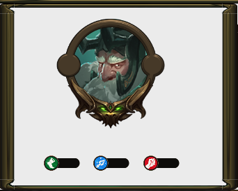
The avatar has a frame and a player icon. The traits are agility, intellect and strength. We’ll have an HTML element for each of these components.
character.css:
<div class="character"> <div class="character-avatar"> <div class="character-icon image"></div> <div class="character-icon-bg image"></div> </div> <div class="character-traits"> <div class="agility image"></div> <div class="intelligence image"></div> <div class="strength image"></div> </div></div>The avatar and the traits should be aligned in a column:
character.css:
.character { display: flex; flex-direction: column;}The character icon takes most of the space - 80% for the avatar and the remaining 20% is for the traits.
character.css:
.character-avatar {    height: 80%;}
.character-traits {    height: 20%;    display: flex;    flex-direction: row;    align-items: center;    justify-content: center;}
.character-icon-bg {    position: absolute;    width: 22rem;    height: 22rem;    background-image: url('images/bg_Avatar.png');    left: 11.5rem;    top: 4rem;}
.character-icon {    position: absolute;    width: 17rem;    height: 17rem;    background-image: url('images/imgAvatar_1.png');    left: 14rem;    top: 4rem;
Set the traits’ size and background images:
character.css:
.agility,.intelligence,.strength {    width: 10rem;    height: 3rem;}
.agility {    background-image: url('images/indicator_Agility.png');}
.intelligence {    background-image: url('images/indicator_Inteligence.png');}
.strength {    background-image: url('images/indicator_Strenght.png');}
Adding the Inventory
Section titled “Adding the Inventory”The inventory is located right next to the character panel. It consists of a grid of slots for the items. Some slots are filled, and some are empty.
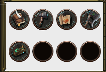
The inventory is positioned at the bottom left part of the middle panel of the main frame. Let’s have eight slots - four in a row:
<div class="inventory"> <div class="slot"> <div class="image item-0 inventory-item"></div> </div> <div class="slot"> <div class="image item-1 inventory-item"></div> </div> <div class="slot"> <div class="image item-2 inventory-item"></div> </div> <div class="slot"> <div class="image item-3 inventory-item"></div> </div> <div class="slot"> <div class="image item-4 inventory-item"></div> </div> <div class="slot"></div> <div class="slot"></div> <div class="slot"></div></div>The inventory is a grid so we’ll again use flexbox:
inventory.css:
.inventory { display: flex; flex-wrap: wrap;}Set the styles for the inventory slots and items:
inventory.css:
.slot {    width: 9.5rem;    height: 9.5rem;    margin-bottom: 1rem;    margin-left: 1rem;    margin-top: 2rem;    background-image: url('images/moba/SkillTree_Slot.png');    background-size: cover;    background-repeat: no-repeat no-repeat;}
.inventory-item {    width: 9.5rem;    height: 9.5rem;    position: relative;    top: 0.6rem;    left: 0.2rem;}
Set the background images of the items in the inventory:
inventory.css:
.item-0 {    background-image: url('images/SmallIcons/icon_Book_Small.png');}
.item-1 {    background-image: url('images/SmallIcons/icon_Hammer2_Small.png');}
.item-2 {    background-image: url('images/SmallIcons/icon_Scroll2_Small.png');}
.item-3 {    background-image: url('images/SmallIcons/icon_Axe_3_Small.png');}
.item-4 {    background-image: url('images/SmallIcons/icon_Bracelet_Small.png');}
Adding the Talents Tree
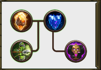
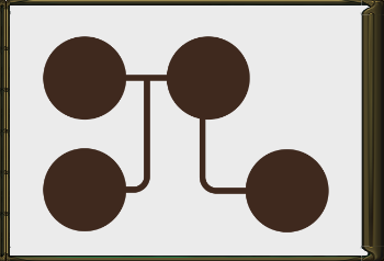
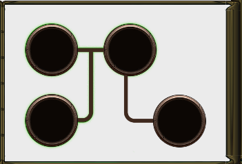
Section titled “Adding the Talents Tree”The talents tree is right next to the inventory. It also consists of slots and items, but they are connected.
Let’s add the tree’s background first:
<div class="talents"> <div class="talent-tree image"></div></div>talents.css:
.talents {    position: relative;}
.talent-tree {    width: 38rem;    height: 28rem;    position: absolute;    left: 3.7rem;    top: 0.5rem;    background-image: url('images/moba/skillTree1_BG.png');
}
It should look like this:
There should be an indicator that shows which talents are selected. It’s the same shape as the talent tree but with a different color and slight glow:
<div class="talents"> <div class="selected-talents image"></div> <div class="talent-tree image"></div></div>It should be a little larger than the main shape so that the color would show.
talents.css:
.selected-talents { width: 40rem; height: 29rem; background-image: url('images/moba/skillPanel_Tree1_Progress.png');}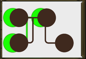
Adjust the position to achieve the effect that you prefer:
talents.css:
.selected-talents { width: 40rem; height: 29rem; position: absolute; left: 3.6rem; background-image: url('images/moba/skillPanel_Tree1_Progress.png');}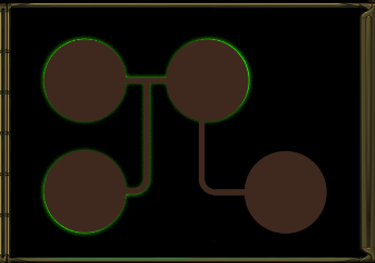
The slots and the images can be structured like the ones in the inventory:
<div class="talents"> <div class="talent-tree image"></div> <div class="selected-talents image"></div> <div class="talent-slot slot-0 image"> <div class="talent talent-0 image"></div> </div> <div class="talent-slot slot-1 image"> <div class="talent talent-1 image"></div> </div> <div class="talent-slot slot-2 image"> <div class="talent talent-2 image"></div> </div> <div class="talent-slot slot-3 image"> <div class="talent talent-3 image"></div> </div></div>Because of the shape of the tree, it’s most convenient to position each slot individually:
talents.css:
.slot-0 {    top: 2.6rem;    left: 4.1rem;}
.slot-1 {    top: 17.1rem;    left: 4.1rem;}
.slot-2 {    top: 2.6rem;    left: 20.1rem;}
.slot-3 {    top: 17.1rem;    left: 30.1rem;}
This is how the talent tree should look now:
The inventory items are nested in the slots so they’ll be automatically positioned. We only need to set the background images:
talents.css:
.talent-0 {    background-image: url('images/moba/icon_Skill_1.png');}
.talent-1 {    background-image: url('images/moba/icon_Skill_2.png');}
.talent-2 {    background-image: url('images/moba/icon_Skill_3.png');}
.talent-3 {    background-image: url('images/moba/icon_Skill_4.png');}
Adding the Resources Bar
Section titled “Adding the Resources Bar”So far the UI should look like this:
The only UI component that’s left to add is the resources bar at the top of the middle panel of the main frame.

It’s a row of elements.
<div class="resources"> <div class="bread resource image"></div>1 <div class="meat resource image"></div>2 <div class="coins resource image"></div>3 <div class="wood resource image"></div>4 <div class="metal resource image"></div>5</div>For simplicity, we add the quantity values right next to the resource images. Feel free to place them in a separate element if you need to.

<div class="top"> <div class="resources"> </div></div>resources.css:
.resources { font-size: 2.5rem; color: #ffffff; width: 50%; display: flex; flex-direction: row; align-items: center; align-content: center;}Set the size and margins of the resources:
resources.css:
.resource { width: 4rem; height: 4rem; margin-left: 2rem; margin-right: 1rem;}Set the background images of the resources:
resources.css:
.bread {    background-image: url('images/moba/icon_Bread.png');}
.meat {    background-image: url('images/moba/icon_Meat.png');}
.wood {    background-image: url('images/moba/icon_Wood.png');}
.metal {    background-image: url('images/moba/icon_Metal.png');}
.coins {    background-image: url('images/moba/icon_Coins.png');}
Set the background image of the main frame if you used light background and the final result should look like this:
Resize the window - the elements update their size to fit the screen.
© 2026 Coherent Labs. All rights reserved.