

Inline Layout
Prysm has a non-standard support for inline layout.
Inline layout for paragraph elements
Section titled “Inline layout for paragraph elements”There is one common use case where the flex layout fails to render the text with the desired result - decorated/styled text. Consider the following line:
<p>This is a <b>simple </b>text line with an emphasized word in it.</p>This code is resolved to a flex container (the <p> element) with three children:
- The first child is a text node with the phrase “This is a ”
- The second child is the
<b>element containing a text node with the phrase “simple ” - The last child of the
<p>element - “text line with an emphasized word in it.”
The flex layout algorithm using flex-row with wrapping. It identifies three separate boxes as children of the <p> element and layouts them one next to the other.
When there isn’t sufficient space on the row for the box, it will be placed on the next row - wrapped. This results in text wrapping between the nodes/phrases instead between the words:
This is a simple
text line with an emphasized word in it.
instead of:
This is a simple text line with an emphasized
word in it.
Having very long phrases results in even worse wrapping and could lead to having decorated short phrases alone in the line:
… end of a long phrase
another long phrase …
To resolve this specific issue we have implemented an custom inline layout algorithm. It can only be used inside <p> elements and is enabled by adding a special attribute key cohinline:
<p cohinline>This is a <b>simple </b>text line with an emphasized word in it.</p>As the feature is still under development, this is the list of known issues at the moment:
- Text-align justify is not working (left, right and center are supported)
- Text-overflow ellipsis is not working
- Box decorations (background, border, masks) on child elements of the paragraph are not supported. You can only use box decorations on the paragraph itself. Background decorations will be applied on the content instead of the paragraph box.
Vertical Alignment
Section titled “Vertical Alignment”The vertical-align CSS property is supported within cohinline paragraphs for inline elements. Supported values are: baseline (default), text-top, text-bottom, and middle. This property allows fine control over how inline elements such as images, icons, or smaller text fragments align vertically relative to the surrounding text.
<p cohinline style="font-size: 48px;"> Some text in the <span style="font-size: 24px; vertical-align: middle;"> middle </span> of bigger text</p>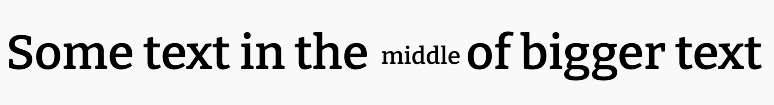
Baseline-aligned elements in cohinline share a single alphabetic baseline derived from the line’s dominant (largest) font metrics. In practice, this means all baseline-aligned text aligns to the baseline of the largest text on the line, regardless of the alignment of neighboring elements. This behavior differs slightly from standard browsers, where larger non-baseline-aligned elements can shift the baselines of smaller inline elements within the same line box.
Non-baseline alignments (text-top, middle, text-bottom) are computed relative to their parent element’s text position, ensuring consistent nested alignment in complex inline structures.
In cohinline line heights are considered final before vertical alignment, non-baseline-aligned elements do not expand the line’s height. Meaning - if a non-baseline-aligned element is the largest one on the line, it will simply occupy the vertical space it needs within the existing line height, rather than expanding it further. This differs from standard CSS behavior, where such elements can increase the line box height.
The following example demonstrates the differences between standard browsers and cohinline mentioned above.
<p cohinline> A big <span style="vertical-align: text-top; font-size: 80px;">text-top </span> AND <span style="vertical-align: text-top; font-size: 12px;">smaller text-top aligned to the paragraph's text position after it</span></p>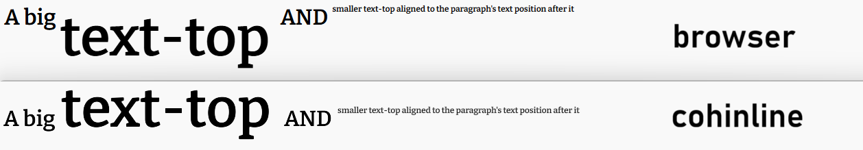
In browsers, the baseline elements sit at the top and the line box is expanded downwards due to the large text-top-aligned element.
In cohinline - baseline-aligned elements are aligned to an alphabetic baseline, produced by the largest text element on the line and the large text-top element occupies the entire “natural” height of the line (i.e. height induced by font metrics & sizes, rather than vertical alignment).
In both cases - the smaller text-top-aligned element is positioned relatively to its parent’s text.
Creating UI Using the Inline Layout
Section titled “Creating UI Using the Inline Layout”In the next section we’ll create the following user interface using primarily inline layout with paragraph elements.
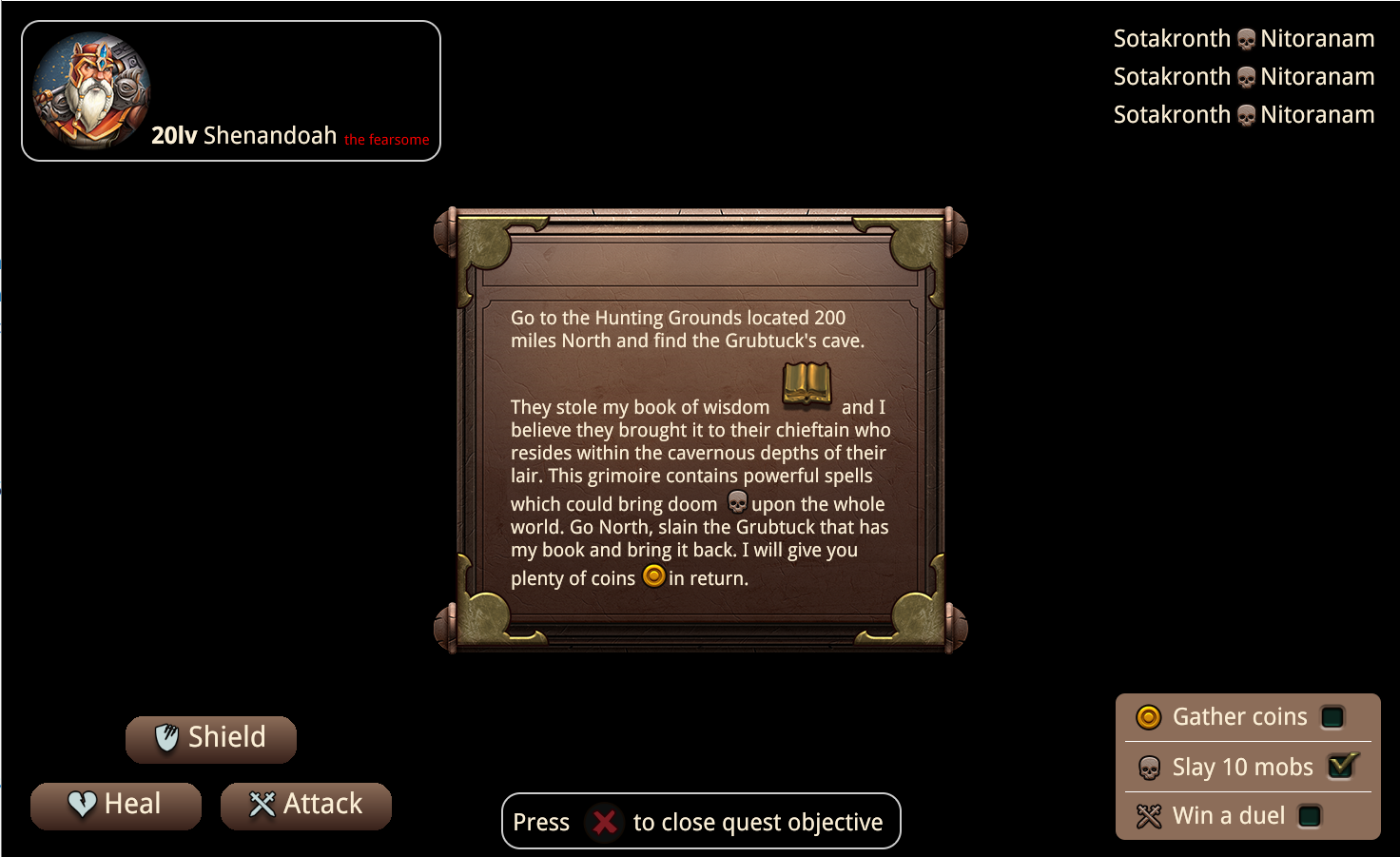
Buttons
Section titled “Buttons”We’ll start by creating a simple button element that has text, background color and an image:
To enable inline layout - use the cohinline custom attribute on an HTML paragraph <p> element.
<p cohinline> <!-- content that needs to be displayed inline goes here --></p>The paragraph and the body elements have some styles by default. Let’s overwrite them:
body {    margin: 0px;    box-sizing: content-box;    color: #fbefd6;    background-color: rgb(0, 0, 0);    text-align: center;}
p {    font-size: 25px;    margin: 0px;}
We can put the image and the text as direct children of the paragraph element in order for them to be displayed inline:
<p class="btn" cohinline> <img src="./img/icon_SpecialSkills.png" class="btn-img"> <span class="text"> Shield</span></p>The image and the text will not be aligned vertically by default. We need to write our own styles in order to achieve that. Since the parent element is a paragraph that usually contains text the easiest way to vertically align its content is by using the same values for line-height of the <p> element and the height of the child elements. This means that if the height of the image is 40px then the line-height of the paragraph should be 40 as well:
.btn {    padding: 0px 10px 0px 0px;    margin: 10px;    width: 180px;    height: 50px;    line-height: 45px;    background-image: linear-gradient(#8c6d59, #38211a);    border-radius: 20px;}
.btn-img {    width: 45px;    height: 45px;}
Once we’ve created as many buttons as we’d like we can put them in a flex grid and place them at the bottom left corner of the UI:
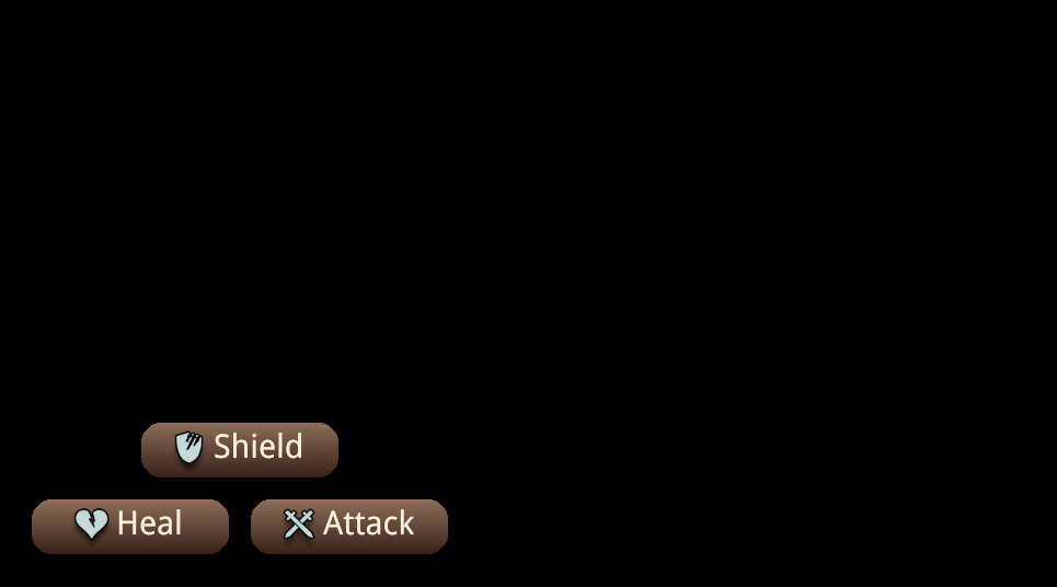
<div class="buttons"> <div class="row"> <p class="btn" cohinline> <img src="./img/icon_SpecialSkills.png" class="btn-img"> <span class="text"> Shield</span> </p> </div> <div class="row"> <p class="btn" cohinline> <img src="./img/icon_SecondarySkills.png" class="btn-img"> <span class="text"> Heal</span> </p> <p class="btn" cohinline> <img src="./img/icon_PrimarySkills.png" class="btn-img"> <span class="text"> Attack</span> </p> </div></div>And the relevant styles:
.text {    font-size: 30px;}
.buttons {    position: absolute;    display: flex;    flex-direction: column;    bottom: 20px;    left: 20px;}
.row {    display: flex;    justify-content: space-around;}
Kill Feed
Section titled “Kill Feed”Next, we’ll create a kill feed. It is a common UI component in video games:
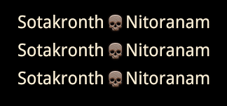
It has the name of the killer on the left and the name of the victim on the right separated by an icon. This can be easily done by using the inline layout. Just as before we create a paragraph element and put our content inside it:
<p class="killfeed-row" cohinline> <span class="offender">Sotakronth</span> <img src="./img/heroWidget_Icon_Deaths.png"> <span class="victim">Nitoranam</span></p>This will create a single line of kill feed.
In order to be able to move them all together we need to wrap them with an absolutely positioned element:
<div class="killfeed"> <p class="killfeed-row" cohinline> <span class="offender">Sotakronth</span> <img src="./img/heroWidget_Icon_Deaths.png"> <span class="victim">Nitoranam</span> </p> <p class="killfeed-row" cohinline> <span class="offender">Sotakronth</span> <img src="./img/heroWidget_Icon_Deaths.png"> <span class="victim">Nitoranam</span> </p> <p class="killfeed-row" cohinline> <span class="offender">Sotakronth</span> <img src="./img/heroWidget_Icon_Deaths.png"> <span class="victim">Nitoranam</span> </p></div>And we set custom margin to the killfeed-row class to overwrite the paragraph’s element default margin:
.killfeed {    position: absolute;    top: 20px;    right: 20px;}
.killfeed-row {    margin: 5px;}
Avatar
Section titled “Avatar”Next, we’ll create the avatar. It has an image and different styles of text. The levels text is bold, the name is normal and the title is a red color and a different font size:
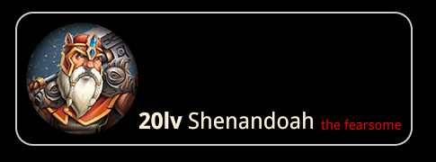
The inline layout allows us to place all of the above elements of the avatar in a single <p> element and they will be on one line:
<p class="avatar" cohinline> <img src="./img/heroWidget_Portrait.png"> <b>20lv </b>Shenandoah <span class="styled">the fearsome</span></p>Again, in order to position the avatar within the whole UI we need to position it absolutely:
.avatar { position: absolute; top: 20px; left: 20px; border: 2px solid #ccc; border-radius: 20px; padding: 10px;}The different styles of text in this case are achieved using a bold <b> tag and a custom css class:
.styled { font-size: 15px; color: red;}Instructions Bar
Section titled “Instructions Bar”Now let’s create the instructions message. Similar to the kill feed item it has text and an image in between the words. This can be achieved using only a paragraph and an image element. If the text doesn’t need any additional styling it doesn’t have to be in an additional HTML element:
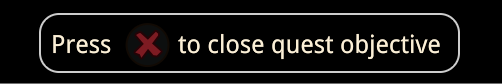
<p class="instructions" cohinline> Press <img src="./img/btn_Close.png"> to close quest objective</p>And the styles of the instructions element itself:
.instructions { height: 60px; line-height: 60px; padding: 0px 10px; position: absolute; border: 2px solid #ccc; border-radius: 20px; bottom: 10px;}Quest Log
Section titled “Quest Log”Now we’ll create the quest log. It is similar to the kill feed in structure, but is more complicated as each row has two images and a styles text. The row itself has a style too - border, background-color etc.
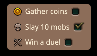
A quest log item’s HTML structure looks line this:
<p class="quest-log-item" cohinline> <img src="./img/heroWidget_Icon_Gold.png"> <span class="quest-log-text">Gather coins</span> <img src="./img/CheckBox_Normal.png"></p>These are the styles for the quest log row and the text inside it:
.quest-log-item {    display: flex;    padding: 10px;    line-height: 30px;    margin: 0px;    border-bottom: 1px solid #fff;}
.quest-log-text {    margin: 0px 10px;}
And again, in order to be able to position all quest log items we wrap them in a single parent element and set an absolute position to it:
<div class="quest-log"> <p class="quest-log-item" cohinline> <img src="./img/heroWidget_Icon_Gold.png"> <span class="quest-log-text">Gather coins</span> <img src="./img/CheckBox_Normal.png"> </p> <p class="quest-log-item" cohinline> <img src="./img/heroWidget_Icon_Deaths.png"> <span class="quest-log-text">Slay 10 mobs</span> <img src="./img/CheckBox_Active.png"> </p> <p class="quest-log-item no-border" cohinline> <img src="./img/heroWidget_Icon_Wins.png"> <span class="quest-log-text">Win a duel</span> <img src="./img/CheckBox_Normal.png"> </p></div>.quest-log { position: absolute; background-color: #8c6d59; bottom: 20px; right: 20px; padding: 0px 10px; display: flex; flex-direction: column; border-radius: 10px; text-align: left;}Quest Objective
Section titled “Quest Objective”Finally, let’s create the quest objective element. It consists of a background image with long text broken into multiple lines with images in-between.
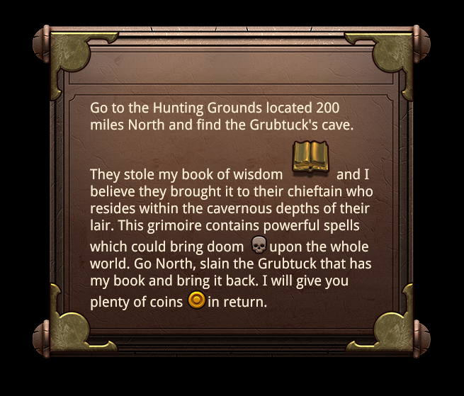
<div class="quest-objective"> <p class="quest-text" cohinline> Go to the Hunting Grounds located 200 miles North and find the Grubtuck's cave. They stole my book of wisdom <img src="./img/skillPanel_Icon_Bookl.png"> and I believe they brought it to their chieftain who resides within the cavernous depths of their lair. This grimoire contains powerful spells which could bring doom <img src="./img/heroWidget_Icon_Deaths.png"> upon the whole world. Go North, slain the Grubtuck that has my book and bring it back. I will give you plenty of coins <img src="./img/heroWidget_Icon_Gold.png"> in return. </p></div>Notice how the images are placed directly next to the text and thanks to the cohinline attribute they are correctly inlined with the text. Note that the images will not be automatically re-sized to fit the font-size - the book image is higher than the text and in creates an offset at the top.
Here are the styles for the quest objective wrapper and the quest text:
.quest-objective {    position: absolute;    top: calc(50vh - 240px);    height: 480px;    width: 570px;    background-image: url(./img/bg_MainMenu.png);}
.quest-text { position: relative; top: 110px; width: 400px; text-align: left; font-size: 20px;}© 2026 Coherent Labs. All rights reserved.