Custom components
Splitting the game user interface into small, reusable and meaningful parts is a very useful concept that saves a lot of resources and time. It allows for the source code to be well structured, manageable and source control friendly.
Reusable game UI in Prysm
In Prysm such a concept can be achieved with the creation and usage of custom elements. They provide a way to encapsulate a component-specific functionality and reuse it. The Web Components suite suite is widely used for the creation of components and Prysm supports a custom Web components library specifically designed for game user interfaces.
Since implementing reusable components from scratch is not straightforward it can result in poor performance in Prysm especially if you are not familiar with the specifics of the custom HTML elements.
Prysm addresses these problems by offering its own Components System and Custom Components. The next sections will go over them on a high level and will demonstrate some examples. You can check the full documentation with usage and examples here.
Prysm Component System & Custom Components
The fundamental idea in the Prysm Component System is the same as in the standard Web Components. It supports the creation and usage of custom elements and also provides a way to encapsulate a component-specific functionality and reuse it.
Prysm Custom Components are custom elements designed specifically for Gameface. They are developed using the Prysm Component System and are a set of the most commonly used game UI elements such as buttons, checkboxes, dropdowns, rangesliders, etc.
The idea of the Custom Components is to significantly reduce the time making game UI while giving a better development experience.
They are:
- Designed with game UI in mind, implementing controls and widgets that are often used in games such are radial menu, stepper, carousel, modal and more.
- Customizable - you can update the styles to match the aesthetic of the game.
- Stateful - you can use JavaScript to update their state at run-time.
- Compatible with the Prysm data binding system. (Partial)
- Performant while running in Prysm.
- Open source so everyone can contribute and enhance them.
- Easy for integration and usage in different frameworks such as React.
Additional resources
CLI
The Prysm Component System has a command-line interface that provides a fast and easy way to create and reuse components.
Refer to the documentation for further information and usage.
Interaction manager
Prysm interaction manager is a library that is part of the Prysm Custom Components. The library can be used for easy implementation of keyboard and gamepad controls, spatial navigation, drag and drop, resizing, rotating and panzoom.
Some game UI made with the Custom Components
The next game UI samples are created using the Custom components.
Settings menu
One of the most common screens in any game is the settings menu where the user can set different game configurations.
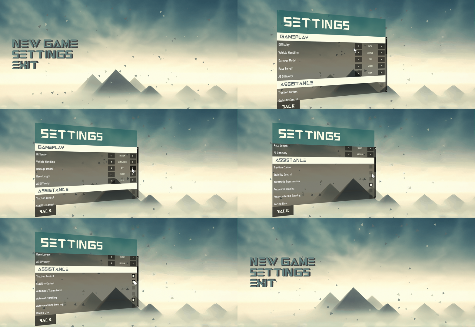
This sample uses react in combination with the Custom Components.
Custom Components that are used in this sample:
- Stepper
- Checkbox
- Rangeslider
- Scrollable container - Showing the scrollbar by default that is typical for the browsers is not supported by Prysm. If you need such then the scrollable container or slider components can be used.
The next sample shows how the components can be used in a more complex in-game settings screen.
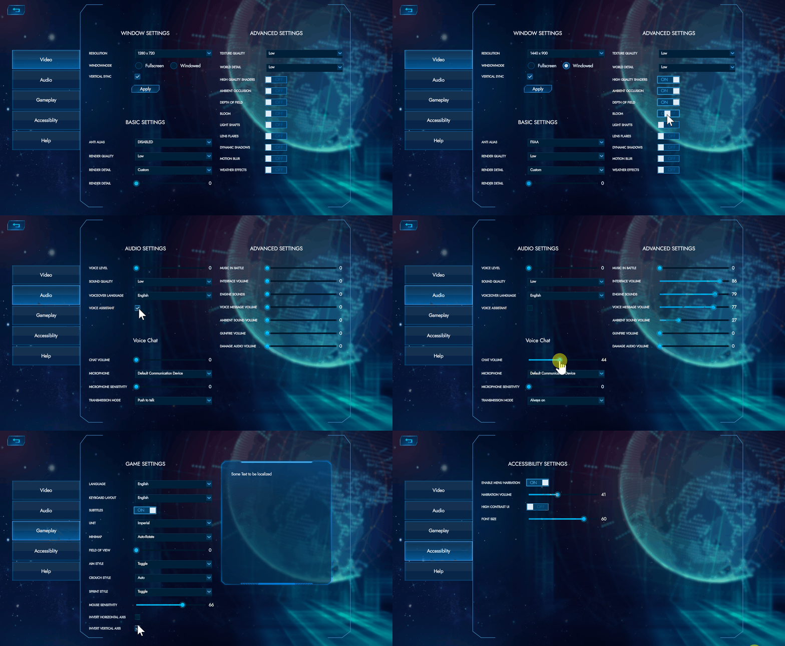
Custom Components that are used in this sample:
Inventory
This sample represents a simple game inventory. The user can navigate between the elements using the keyboard, select an element and change its position to any free place of the grid.
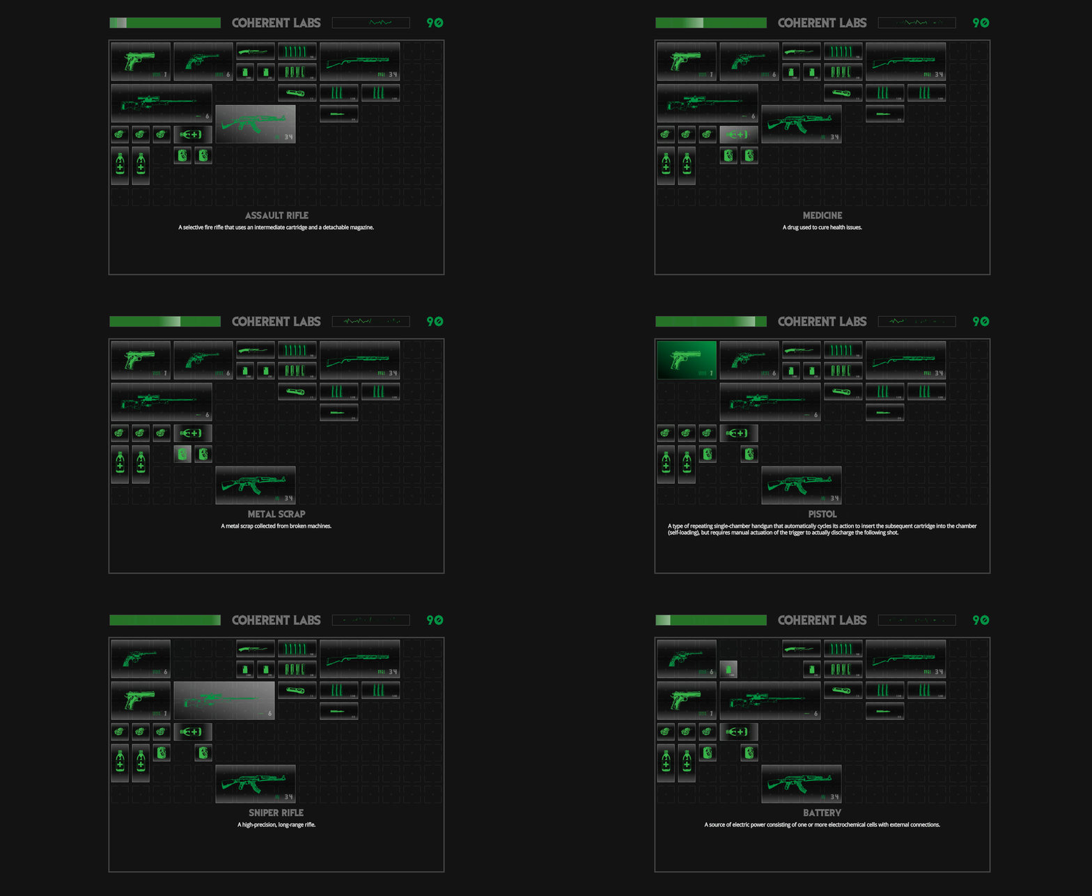
Custom Components that are used in this sample:
For the keyboard interactions the interaction manager is used.
Another inventory item that can be created with the components is a tooltip that is shown when an element is selected.
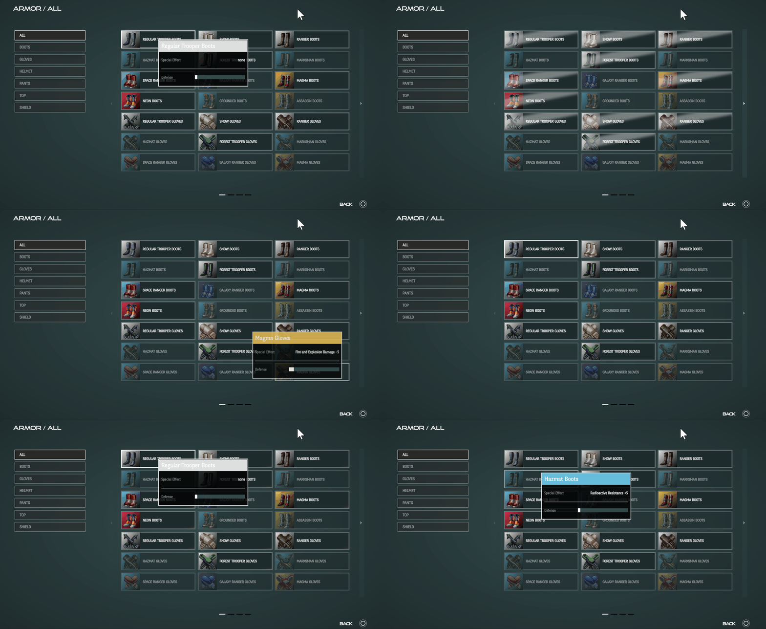
Custom Components that are used in this sample:
For the keyboard interactions the interaction manager is used.
Radial menu
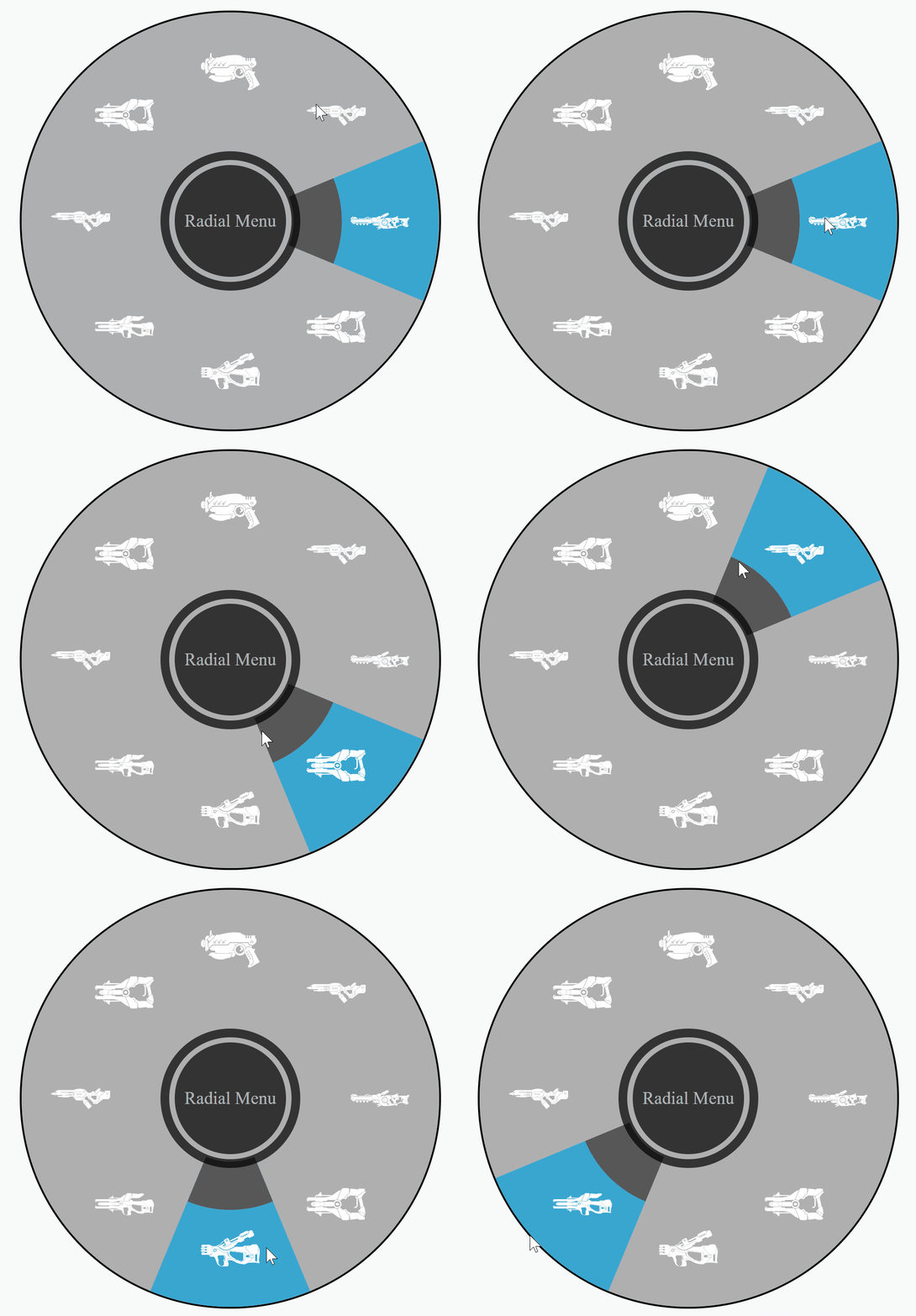
Some games have an integrated radial menu so the users can quickly select the active item while are in combat. The Custom Components set has such radial menu as well.
Loading screen

The loading screen can be used when a new game has started for example.
Custom Components that are used in this sample:
Weapon shop
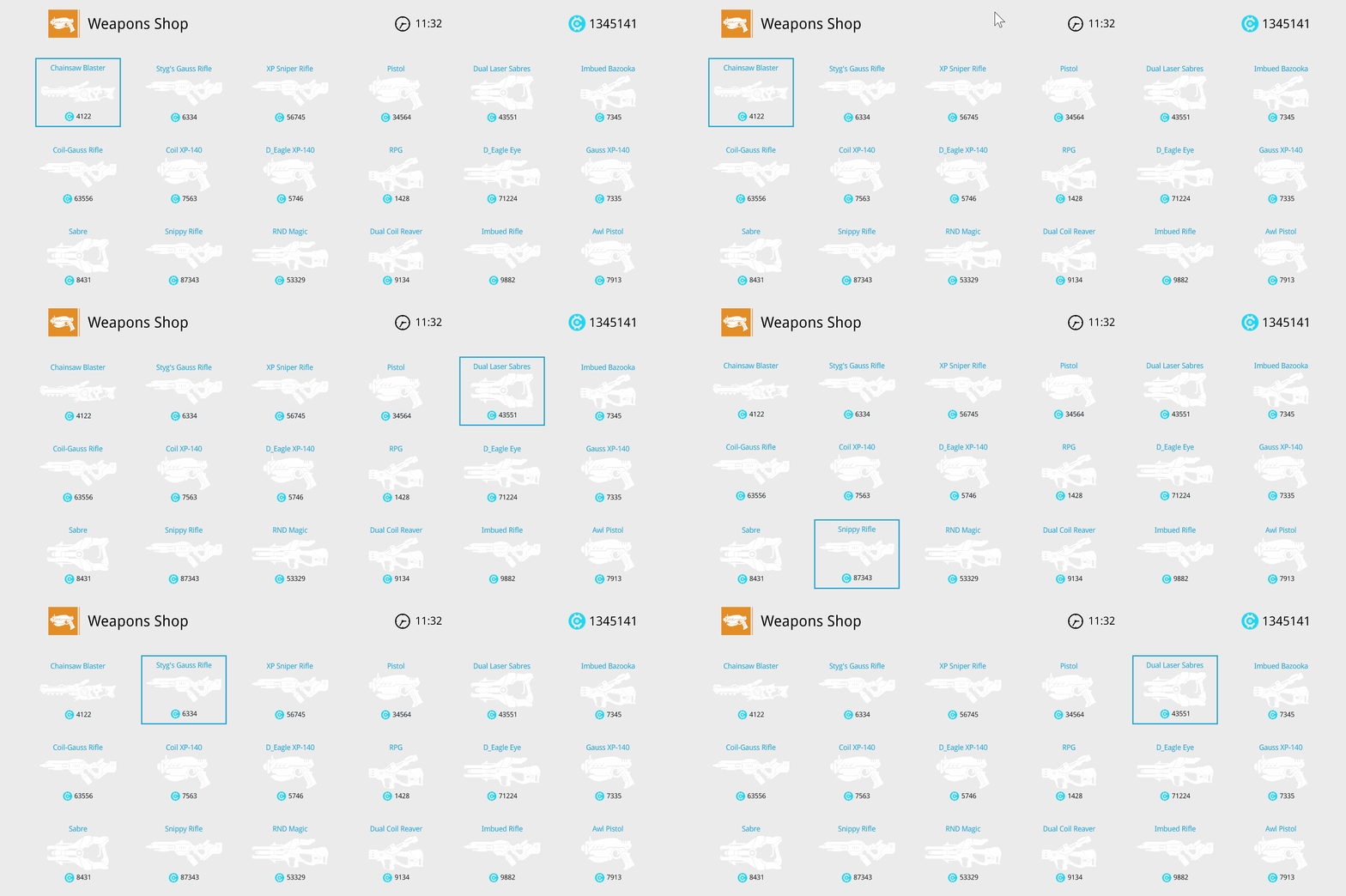
The sample uses the custom components with their default styles. The components can be easily re-stylized to match the game UI.
Custom Components that are used in this sample: