

Creating an Inventory
In this example we will create an inventory using the Gameface components library.
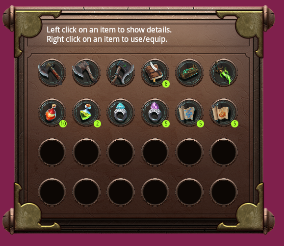
The inventory sample shows how to create, style, nest and reuse custom components. The inventory will hold a list of inventory items - weapons and consumables. Each item will be presented with an image. Clicking on an item with the left mouse button will open a details panel for the selected element. The right mouse button will equip/use weapon/consumable respectively.
The complete project can be found in Samples/uiresources/Components along with the asset.
For this tutorial we’ll create the following components:
- Inventory - will hold all items
- InventoryItem - will support mouse interaction and will handle the display of the details window
- Weapon - a type of InventoryItem that has an image and a name
- Consumable - a type of InventoryItem that will be usable and will have a quantity
and use the pre-made modal component.
Getting Started
Section titled “Getting Started”Installing the CLI
Section titled “Installing the CLI”To get started we first need to install the coherent-guic-cli
npm i -g coherent-guic-cliThe coherent-guic-cli is a tool that helps you create and develop components and can also setup a development environment allowing an easier way to create a UI using the components.
Setting up the project
Section titled “Setting up the project”To set up the project, we can now use the command line interface we’ve just installed to run the following command
coherent-guic-cli create-project webpack ./inventory-uiThis will create a inventory-ui folder with the following structure
node_modules/ index.html index.js package-lock.json package.json README.md style.css webpack.config.jsAdding the modal component
Section titled “Adding the modal component”To add the pre-made modal component we just need to do:
npm i coherent-gameface-modalCreating a custom component
Section titled “Creating a custom component”To create a custom component we will use the CLI with the coherent-guic-cli create-component my-component ./my-components-folder command.
Here my-component is the name of the component and my-components-folder will be the folder where all of the component should be located.
Components created with the CLI will have the following structure:
coherent-gameface-components-theme.css demo.js index.html index.js package.json README.md script.js style.css template.htmlWhere script.js will be the main logic of the component, template.html the template of the component and the style.css - the component styling.
To be able to use the component we’ve created, we have to build it by using the CLI again. We can do that by navigating to the component folder and running coherent-guic-cli build. If we don’t want to run the build command every time we change something we can also do coherent-guic-cli watch.
If we use the components in a larger project, we also have the option to preview them in a Playground like setting before integrating them in our UI. To do that we have to run coherent-guic-cli build-demo which will create a /demo folder where you can see the component.
script.js
Section titled “script.js”The script.js file is the main script of our component. It handles all of the logic of the component.
The most important methods here that we need to focus on are:
initwhere we render the template.connectedCallbackwhich is called when the component is added to the DOM.
It’s also recommended to use the constructor for setting up the initial state, event handlers, or the template. You shouldn’t inspect the element’s attributes and children as they might not be available yet. Access them in the connectedCallback.
Components Library
Section titled “Components Library”To streamline component development we’ve created the coherent-gameface-components library. Its purpose is to provide a BaseComponent that all other components are built upon and utility methods to create these components.
These are some of the most used methods from the library:
- whenDefined - returns a Promise that resolves when the named element is defined.
- defineCustomElement - defines a custom component.
template.html
Section titled “template.html”The template file has the HTML markup that will be rendered with the custom component. The one thing that we have to note here is the availability of the component-slot custom HTML element which is modeled after the existing web <slot> element
It allows you to insert additional markup at runtime. For example in the default template code we can see the following:
<div class="my-component"> <span>Hello </span> <component-slot data-name="name">there!</component-slot></div>Where we have a component-slot for the name. So now if we render our component and do
<my-component class="my-component-component"> <component-slot data-name="name">my-component</component-slot></my-component>it will render Hello my-component instead of Hello there!
Demo files
Section titled “Demo files”The demo.js and index.html files are used to create the demo to test the custom component. If there is a need for additional JavaScript or we need to test different variations of the component, it should be added to these files.
Creating the components for this tutorial
Section titled “Creating the components for this tutorial”Inventory
Section titled “Inventory”The first component we’ll start with is the Inventory component. This is the one that will hold all of our components.
To make it, we just need to run the following command in the root folder:
coherent-guic-cli create-component game-inventory
This will create a game-inventory folder where our new component is.
First let’s change the template file. The CLI has generated a div element with a component-slot and a simple text in a span:
<div class="GameInventory"> <span>Hello </span> <component-slot data-name="name">there!</component-slot></div>We won’t need any of these, so let’s replace it with a container that has an info box and a grid of slots where the item will be held:
<div class="inventory-container"> <div class="info"> <span>Left click on an item to show details.</span> <span>Right click on an item to use/equip.</span> </div> <div class="slots"> <div class="slot"></div> <div class="slot"></div> <div class="slot"></div> <div class="slot"></div> </div></div>For this example we’ll be using 24 div.slot elements.
The Inventory should have two states - opened and closed. We’ll use a boolean value to represent that so we’ll add this to the constructor:
this.state = { display: false};Now that we have the correct template, let’s load it in the component. Since the CLI has generated the template loading part for us we just need to add the items to the inventory. To do that let’s create an onTemplateLoaded function that we’ll call in the init function:
init(data) { this.setupTemplate(data, () => { components.renderOnce(this); // attach event handlers here this.onTemplateLoaded(); });}Then we add the function bellow the connectedCallback:
/*** Called when the component's template was loaded.*/onTemplateLoaded() { this.style.display = this.state.display ? '' : 'none';}Inside for now we will just show or hide the inventory based on the state.
To complete the inventory we’ll also need to add the following methods.
addInventoryItems- adds the items from theInventoryItemsmodel to the InventoryaddInventoryItem- adds a single itemaddItemAt- adds an item at a specific slotfindFreeSocketId- finds the id of a socket that has no item in itisSocketFree- checks if a socket has an item in itshow- shows the inventory
Which will be added to the script.js file
/*** Adds the inventory items to the inventory.* InventoryItems is the data binding model registered in the global* namespace by Gameface.*/addInventoryItems() {    const itemsIds = Object.keys(InventoryItems.list);
    for (let itemId of itemsIds) {        this.addInventoryItem(InventoryItems.list[itemId], itemId);    }}
/*** Creates an inventory item instance and adds it into an available slot* in the inventory.* @param {Object} item - the inventory item from the model (InventoryItems)* @param {string} itemId - the item's identifier* @param {number} [socketId=0] - the inventory socket's id into which the* item should added. The default is 0 - this will add it in the next free socket.*/addInventoryItem(item, itemId, socketId = 0) {    let WrappedComponent = 'inventory-consumable';    if (item.typeId === 0) WrappedComponent = 'inventory-weapon';
    const inventoryItem = document.createElement('inventory-item');    inventoryItem.socket = socketId;    inventoryItem.itemid = itemId;    inventoryItem.imageurl = `{{InventoryItems.list.${itemId}.image}}`;    inventoryItem.description = item.name;    inventoryItem.WrappedComponent = WrappedComponent;    this.addItemAt(inventoryItem, socketId);}
/*** Adds an inventory item instance to a given inventory socket.* @param {Object} item - the inventory item from the model (InventoryItems)* @param {number} socketId - the inventory socket's id into which the* item should added*/addItemAt(item, socketId) {    const itemSlotElements = this.getElementsByClassName('slot');
    if (!this.isSocketFree(socketId)) socketId = this.findFreeSocketId();    if (socketId === undefined) return showMessage(`I can't cary anymore!`);
    this.itemSlots[socketId] = socketId;    itemSlotElements[socketId].appendChild(item);}
/*** Finds the first free inventory socket.* @returns {number} - the id of the socket.*/findFreeSocketId() {    for (let i = 0; i < this.itemSlots.length; i++) {        if (this.itemSlots[i] === undefined) return i;    }}
/*** Checks if an inventory socket with a given id is free.* @returns {boolean} - true if it's free, false if it's not*/isSocketFree(socketId) {    return this.itemSlots[socketId] === undefined;}
/*** Show the inventory instance.*/show() {    this.state.display = true;    this.style.display = '';}
and then we’ll finish everything by adding the last bit of code to the onTemplateLoaded function:
/*** Called when the component's template was loaded.*/onTemplateLoaded() { // inventory itemSlots, not to be confused with Web Component <slot> this.itemSlots = new Array(this.getElementsByClassName('slot').length); this.addInventoryItems(); this.style.display = this.state.display ? '' : 'none';}The Inventory component is an ES6 module. It uses import and export statements. Meaning that in order to use it, we will need to import it into our project. In order to do that we have to build the component first.
As previously discussed, to build the component we have to navigate to the Inventory folder and execute:
coherent-guic-cli build
The build command will generate the following:
game-inventory+---dist| GameInventory.development.js| GameInventory.production.min.js|We’ll import the development build to the index.js file like so:
import './game-inventory/dist/game-inventory.development';import './game-inventory/style.css';along with the styles.
File structure
Section titled “File structure”We’ll generate most of the files using the CLI. This is how your project should look at the end of this guide:
Components:| cohtml.js| index.html| model.js| package-lock.json| package.json| styles.css|+---consumable| | index.js| | package.json| | README.md| | script.js| | style.css| | template.html| || \---dist| consumable.development.js| consumable.production.min.js|+---images|+---inventory| | index.js| | package.json| | README.md| | script.js| | style.css| | template.html| || \---dist| inventory.development.js| inventory.production.min.js|+---inventory-item| | index.js| | inventoryItem.js| | package.json| | README.md| | script.js| | style.css| | template.html| || \---dist| inventory-item.development.js| inventory-item.production.min.js|+---node_modules|\---weapon | index.js | package.json | README.md | script.js | style.css | template.html | +---dist | weapon.development.js | weapon.production.min.js |We strongly recommend a domain-driven file structure. It is more maintainable and it scales better in big applications. If we group the files by nature - for example, we put all components in one folder, all styles are another we’ll end up with huge folders and we’ll have to add a file into each folder every time we want to add a new component.
Inventory Item
Section titled “Inventory Item”Type coherent-guic-cli create-component inventory-item to create a new component. As we mentioned earlier in the tutorial the inventory item will have a details panel that will be opened on click.
Inventory items will of two types - consumable and weapon. Where the consumable item will have quantity and the weapon - won’t.
We’ll be making new components for the weapon and consumable that will be wrapped in an inventory-item in order to share functionality.
The inventory-item will populate itself with either a weapon or a consumable depending on the type of the current item.
To do that we’ll create a setup function in the script.js of the component and use it in the connectedCallback.
connectedCallback() {    this.classList.add('inventory-item');
    this.setup();}
setup() {    const wrappedComponent = document.createElement(this.WrappedComponent);    wrappedComponent.itemid = this.itemid;    wrappedComponent.imageurl = this.imageurl;    wrappedComponent.description = this.description;    wrappedComponent.onClick = this.onClick;    this.appendChild(wrappedComponent);}
In order to show the details of each item, we’ll be using the modal component that we added when we were setting up the project.
The modal component has 3 slots for the header, body and footer. We’ll be adding the item title in the header and the image and description of the item in the body. We’ll leave the footer empty.
We’ll be creating these elements dynamically through JavaScript and then appending them to a gameface-modal element. To do that we’ll create a createDetailsSlots and showDetailsModal functions
/*** Creates the elements which will be added to slots and nests them into a* wrapper element.* @returns {HTMLElement} content*/createDetailsSlots() {    const content = document.createElement('div');    const body = document.createElement('div');    const header = document.createElement('div');    const footer = document.createElement('div');
    body.setAttribute('slot', 'body');    header.setAttribute('slot', 'header');    footer.setAttribute('slot', 'footer');
    const headerContent = document.createElement('div');    headerContent.textContent = 'Item Details';    headerContent.className = 'item-details';    header.appendChild(headerContent);
    const imageItem = document.createElement('div');    imageItem.style.backgroundImage = `url(${InventoryItems.list[this.itemid].image})`;    imageItem.classList.add('info-image');    body.appendChild(imageItem);
    const description = document.createElement('div');    description.textContent = this.description;    body.appendChild(description);
    content.appendChild(body);    content.appendChild(header);    content.appendChild(footer);
    return content;}
/*** Creates a modal window component and passes the elements created in* createDetailsSlots to be put in the modal's slots.*/showDetailsModal() {    const details = document.createElement('gameface-modal');    details.appendChild(this.createDetailsSlots());
    const detailsContainer = document.getElementById('details-container');    detailsContainer.innerHTML = '';    detailsContainer.appendChild(details);    document.querySelector('gameface-modal').style.display = 'flex';}
and we’ll have to show the modal so we’ll add a click listener in the component constructor:
constructor() { super(); this.onClick = () => this.showDetailsModal();}Then we have to run coherent-guic-cli build and again import the style and bundled JS files in our project index.js
import './inventory-item/dist/inventory-item.development';import './inventory-item/style.css';Weapon
Section titled “Weapon”Just like with the previous components, we’ll use the CLI to create it. We need to run coherent-guic-cli create-component weapon in our root project folder.
The weapon component is going to have logic for setting up the content - the image and the description and a method for equipping. We will set up the content and attach the event listeners in the connectedCallback.
Apart from that we’ll also need to call engine.synchronizeModels() to make sure that the data binding attributes are updated.
First we’ll create our setupContent and equip functions:
    /**    * Sets the html content of the consumable item and sets the data binding attributes.    */    setupContent() {        this.classList.add('inventory-weapon');        this.querySelector('.image')            .setAttribute('data-bind-style-background-image-url', this.imageurl);        this.querySelector('.weapon')            .setAttribute('data-bind-class-toggle', `disabled:{{InventoryItems.list.${this.itemid}.equipped}} == true`);    }
    /**    * Equips the weapon by setting its equipped property to true.    */    equip() {        if (InventoryItems.list[this.itemid].equipped) return;
        InventoryItems.list[this.itemid].equipped = true;        engine.updateWholeModel(InventoryItems);        engine.synchronizeModels();    }
Then we need to add the click function from the inventory-item component, which we’ll do in the constructor:
constructor() { super(); this.onClickBound = (e) => { if (e.button === 2) return this.equip(); // on click is assigned in InventoryItem this.onClick(); }; this.template = template; this.init = this.init.bind(this); }and then attach the event listener for this function in the init method:
init(data) { this.setupTemplate(data, () => { components.renderOnce(this); // attach event handlers here this.setupContent(); this.addEventListener('mousedown', this.onClickBound); engine.synchronizeModels(); }); }And since by standard we can’t have a component with a single name (they have to be two separated by a hyphen), we need to change:
components.defineCustomElement("inventory-weapon", Weapon);Finally we need to change the template to add the image and description.
<div class="weapon"> <div class="image"></div> <div class="description"></div></div>And as always we run coherent-guic-cli build and include the bundle and styles in the main index.js:
import './weapon/dist/weapon.development';import './weapon/style.css';Consumable
Section titled “Consumable”For our last component we’ll use the CLI to create it again coherent-guic-cli create-component consumable.
Just like the weapon component, the consumable is also an inventory item, but instead of equipping it as right mouse button interaction, it can be used using the left mouse button. Its template will also be a little different than the weapon’s component as the consumable has to have a quantity info badge.
And like the weapon, we need to set it up in a setupContent function:
    /**    * Sets the html content of the consumable item and sets the data binding attributes.    */    setupContent() {        this.classList.add('inventory-consumable');
        this.querySelector('.image').setAttribute('data-bind-style-background-image-url', this.imageurl);        this.querySelector('.consumable').setAttribute('data-bind-class-toggle', `disabled:{{InventoryItems.list.${this.itemid}.quantity}} == 0`);
        this.querySelector('.quantity').setAttribute('data-bind-value', `{{InventoryItems.list.${this.itemid}.quantity}}`);    }
but unlike the weapon, here we’ll have a use method, rather than equip
/** * Uses one of the consumable items by decreasing its quantity by 1. */ use() { InventoryItems.list[this.itemid].quantity -= 1; engine.updateWholeModel(InventoryItems); engine.synchronizeModels(); }Then we add it to the constructor just like with the weapon:
constructor() { super(); this.template = template; this.init = this.init.bind(this); this.onClickBound = (e) => { if (InventoryItems.list[this.itemid].quantity === 0) return; // right mouse button if (e.button === 2) return this.use(); this.onClick(); }; }and we set it up in the init method:
init(data) { this.setupTemplate(data, () => { components.renderOnce(this); // attach event handlers here this.setupContent(); this.addEventListener('mousedown', this.onClickBound); engine.synchronizeModels(); }); }Same as for the weapon, we need to change the defined custom element:
components.defineCustomElement('inventory-consumable', Consumable);And change the template:
<div class="consumable"> <div class="image"></div> <div class="quantity"></div></div>Run coherent-guic-cli build to build it and add the bundle and style to the root index.js:
import './consumable/dist/consumable.development';import './consumable/style.css';Bringing it all together
Section titled “Bringing it all together”To finish this example, we’ll need to replace the content inside the <body> tag with:
<body> <div id ="toggle_inventory" class="button">Open Inventory</div> <div class="ui"> <div id="inventory-wrapper"></div> <div id="details-container"></div> </div></body>And add our inventory inside the div.inventory-wrapper
<body> <div id="toggle_inventory" class="button">Open Inventory</div> <div class="ui"> <div id="inventory-wrapper"> <game-inventory></game-inventory> </div> <div id="details-container"></div> </div></body>The last steps before finishing this sample are to add functionality to the Open Inventory button. We do this by adding a script tag to the bottom of our <body> element:
    <script>        const toggleInventoryBtn = document.getElementById('toggle_inventory');
        toggleInventoryBtn.addEventListener('click', () => {            const inventory = document.querySelector('game-inventory');            inventory.show();        });    </script></body>
And we’ll create a model.js file that will have the information about our inventory items:
(() => { engine.createJSModel('InventoryItems', { list: { 'icon_Axe_1_Small': { typeId: 0, name: 'Axe 1', image: 'images/icon_Axe_1_Small.png' }, 'icon_Axe_2_Small': { typeId: 0, name: 'Axe 2', image: 'images/icon_Axe_2_Small.png' }, 'icon_Axe_3_Small': { typeId: 0, name: 'Axe 3', image: 'images/icon_Axe_3_Small.png' }, 'icon_Book_Small': { typeId: 1, quantity: 8, name: 'Book', image: 'images/icon_Book_Small.png' }, 'icon_Bracelet_Small': { typeId: 0, name: 'Bracelet', image: 'images/icon_Bracelet_Small.png' }, 'icon_Dagger_Small': { typeId: 0, name: 'Dagger', image: 'images/icon_Dagger_Small.png' }, 'icon_HealthPotion_Small': { typeId: 1, quantity: 10, name: 'HealthPotion', image: 'images/icon_HealthPotion_Small.png' }, 'icon_PoisonVial_Small': { typeId: 1, quantity: 2, name: 'PoisonVial', image: 'images/icon_PoisonVial_Small.png' }, 'icon_Ring1_Small': { typeId: 0, quantity: 5, name: 'Ring 1', image: 'images/icon_Ring1_Small.png' }, 'icon_Ring2_Small': { typeId: 1, quantity: 5, name: 'Ring 2', image: 'images/icon_Ring2_Small.png' }, 'icon_Scroll1_Small': { typeId: 1, quantity: 5, name: 'Scroll 1', image: 'images/icon_Scroll1_Small.png' }, 'icon_Scroll2_Small': { typeId: 1, quantity: 5, name: 'Scroll 2', image: 'images/icon_Scroll2_Small.png' }, } });})();Finally we add the model.js along with the cohtml.js library to the root index.html in the <head> tag:
<script src="./cohtml.js"></script> <script src="./model.js"></script>and we run npm run build in the project root to build our UI.
In the /build
© 2026 Coherent Labs. All rights reserved.